Intermission - Weeks 2 & 3

I've pretty much given up on trying to be productive during this break between semesters; I'll be working hard again soon enough. For now, I'm taking things at a leisurely pace. I've finished all of the mandatory UVing on my Juggler. I won't say that I've completed the UVing for the character because I don't know if I'll eventually decide that I need UVs for everything once I really get into texturing it - perhaps I'll get really particular about my grunge maps and decide that I need to paint them in Photoshop rather than using procedurals, I don't know - but I do know that I've completed UVing all of the objects that will need any kind of normal or bump map applied to them.

After UVing I started testing different kinds of maps for detail, as well as different ways of creating those maps. I began by attempting to test the difference in render quality between normal and displacement maps, but I was unsuccessful in my attempts to bake displacement maps: they always turned out solid gray, with no image or tonal variation whatsoever. I baked them using Maya transfer maps and followed all of the same steps that I've used to successfully create normal maps with those tools, and I even confirmed those steps through online tutorials, but, clearly, I'm missing something. I suspect that I know what the problem is, though I won't speculate here in case I'm entirely off base. In any case, the reason that I wanted to test displacement maps was because Modo's Ambient Occlusion render pass didn't seem to register the surface variations created by normal maps when I rendered the Juggler's paint brush and palette a few weeks ago. I have since rendered images of other objects with normal maps applied and the AO does register their surface details, so I'm no longer so concerned that I haven't been successful with the displacement maps: I think that the normal maps will suffice.
I also tested alternate methods of generating normal maps. I had previously created alphas to mask and apply deformations to objects in ZBrush when I needed to add something like an embossed graphic to an object. It worked pretty well, but I was getting a little more pixelation in the embossed shapes than I liked for detail shots. I was also getting a bit of warping of the masking alpha if my polygons in the masked-off area were of anything other than square proportions. The distortion wasn't too bad as long as I got things close to square, but, again, I just wasn't happy with the results that I was getting for detail shots. I had thought that my only solutions to these problems would be making sure that all of my meshes were divided as evenly as possible and subdividing the high-res meshes one more time in ZBrush before masking and applying the deformations, but then my roommate helped me out once again by showing me a trick in XNormal. That program has a tool to create normal maps from black and white photographs provided the user has one photograph lit from each of the four directions: left, right, top, and bottom. These circumstances can be mimicked in Photoshop using the Bevel and Emboss layer style from different angles on text and other solid graphics. I generated a normal map for the Juggler's Spray Bottle label this way and the result was much cleaner than my previous method of creation had provided me:

The top image was baked using Maya Transfer Map tools after using an alpha to mask off areas for applying deformations to a high-res mesh in ZBrush. The bottom image was baked in XNormal using the Photo-to-Normal Map tool set. The top image clearly contains more depth, but is blurred, warped, and aliased in certain areas of the image (particularly near the barcode). The bottom image is much cleaner. I also believe that I could make an image with greater depth like that of the top image, but with the crispness of the bottom image, in XNormal by simply adjusting the Bevel and Emboss layer style settings in Photoshop if I wanted to.

After these tests were completed I compared a spray bottle with the normal map label applied in Modo to the spray bottle with a bump-mapped label that I rendered previously in Modo and decided that I preferred the normal-mapped version:

(Bump Map on left, Normal Map on right.)

(Bump Map on left, Normal Map on right)

The bump map looks more like something etched into the surface, which is great - that's exactly what I intended it to resemble when I applied that map in the first place - but I think that I prefer the embossed look: it's what I always picture in my head when I envision these types of details on my Juggler sculpture. Also, the smaller details are much more muddled on the bump map: the warning label and barcode on the back have quite a bit of aliasing in the bump version, but the normal-mapped version, which was rendered on the same settings, has hardly any.

The final piece of the Juggler that I worked on this week was the image in the photo frame. I took a photograph that I had and turned it into an alpha, then used the same masking and deformation ZBrush technique that I described earlier to create a kind of embossed-version of the photo on a high-res mesh and baked a normal map using Maya's transfer maps. The normal map took a long time to bake. I intend to use XNormal to bake the next normal map that I create from a combination of high-res and low-res models, because I've been told that it's much quicker but still yields very nice results.

I believe that that's it for my blog updates between semesters. I have one more week off and intend to use it to create additional normal maps, but I doubt that I'll have enough progress that I shall feel obliged to update this blog again before my summer semester begins. As I stated above, I feel justified in taking a break until my next semester starts. I worked hard last semester and will be working hard again soon, with two classes to finish in half of the amount of time that a Fall or Spring semester would take. Here's to the calm before the storm... :)

Intermission - Week 1

It's my break between the AAU Spring and Summer semesters. I've been taking great advantage of my free time this week to get a little slacking off done, but I still have a bit of progress that I can report:

First and foremost, I fixed the six-star junction in the facial geometry of my Juggler's baby. (It is now a five-star junction instead, but five star's are normal for properly flowing facial topology as I understand it, so I consider this problem "solved".) I also adjusted the UVs on the baby, because, apparently, I left them unfinished when I worked on them before... 

The vertices at the six-star (top left) and five-star (bottom left) junctions
on the baby's face are highlighted in yellow.

The next thing that I did was give the vacuum a bit of extra character:

This is something that I've been considering doing for some time now because the head of the vacuum was looking much too plain to me. I kept telling myself that it was okay: much of that part of the vacuum is hidden behind the apron and under the Juggler's other objects, but I just couldn't let go of the idea that I should improve upon it. My first idea - the one that nagged at me more than anything else - was that a vacuum should have a headlamp. I know that this is probably a silly notion, because most of the vacuums that I see these days don't have headlamps anymore, but the vacuum that I grew up with had one, so it's stuck in my head as a standard element of vacuum cleaners - especially bag vacuum cleaners. Once I added the headlamp it occurred to me to add a few more plane breaks to the geometry of the vacuum head; as it was, the head was looking more or less like two blocks stacked on top of one another. I added the grooves and the extra rim, and then, to finish the whole thing off, I gave it a little plaque in which I plan to sculpt a unique brand logo. I then UVed those portions of my additions that will need maps applied and exported the OBJs.

Finally, I sculpted a wedding ring to place over the Juggler's finger puppet gloved ring finger. This is another idea that has been nagging at me for awhile. After I modeled the face I began thinking about feminine adornments, such as jewelry, to give her a little more humanity. I realize that she is a sculpture made out of objects, but she's representative of a human, and a human model without accessories would be fairly boring. The first thing that I contemplated adding was a necklace (and it's possible that I still may do so, though  I might just sculpt that one onto the surface of the skin of her neckline instead), and when I contemplated a reason and design for the necklace I thought about how my sister (who was my primary inspiration for the Juggler piece) only wears jewelry that has an emotional connection for her: anniversary gifts from her husband or milestone birthday gifts from our grandmother. This led me to think about what may be her most significant piece of jewelry - her wedding ring - and I realized that I don't really have anything representative of a husband in my Juggler sculpture. I plan to texture the photo frame in her pocket with an etching of a family photo, but most of the image will be hidden inside of the pocket, and I feel like she needs a better representation of the person that helps this woman hold everything together as well as she does. Thus, I give you, the Wedding Ring:

It took a few days to build the ring in Maya. At first I just wasn't liking anything that I did (first the ring was too thick, then parts of it were too thin...), then it took much longer than I anticipated to shape all ten unique letters in the words - not to mention tweaking all 14 characters to fit into the narrowing archway, and then there was the setting debacle...

I don't even know how many hours I spent looking at those prongs holding the large diamond in place - I must have redone them at least five times, sometimes with painstakingly slow processes.

I got the front view - the angle that blends into the wording - of the first two prongs done first, then I bowed them out forward by rotating them a bit in the side view. I thought that would be the end of it, but when I switched cameras back to the perspective view, I saw that rotating them forward had completely messed up my front view. I was expecting that the front view might get a little squished looking with the rotation (and prepared to fix it if it did), but instead the geometry looked twisted. It took me a little while to figure out why rotating it in only one direction would cause it to look twisted, but eventually it made sense and the only way that I could see to fix it was to line the geometry back up by hand, one row of vertices at a time. Once I got the prong coming up off of the "y" fixed I copied it in reverse to the other side and attached it to the "m". Then I copied and attached both prongs to the back side of the ring. Then I moved onto the prongs holding the sides of the diamond in place.

I duplicated the faces of one of the prongs - and, yes, I was foolish enough to attach all of the prongs to the base, then realize that I still wanted to duplicate them more, so that, instead of duplicating an object, I had to take time to select and duplicate faces - and rotated it 90 degrees. Only then did I realize that I needed the side prongs straight rather than bowed off at an angle like my front ones were. I should have just made new geometry when I realized my error, but instead I decided to select and center each edge ring one at a time to ensure that the tapering width of the side prongs remained consistent with the taper of the front ones. I have no excuse for this decision. I don't know what I was thinking - clearly, I wasn't. It took much longer to move all of the vertices by hand than it would have done to just make new geometry with a similarly tapering width to the front prongs. Especially when one does the whole thing twice... In the beginning of the process of centering all of the edge rings I was attempting something that I thought might speed the process along, but it didn't seem to be working. Only after I finished lining everything up in the orthographic side view did I look at another view and realize that those early attempts had messed things up from a different direction, and sorting the mess out would have taken much more time than redoing all of the work I'd just done, so I "Ctrl+Z"-ed about as far back as I could go and did it all again.

Then I made the diamond.

That's right. That's what I wrote. I made the casing (which didn't have to be a particular shape), and then I made the contents. Do you see my error? Because I do - it's glaringly obvious to me now... I ended up having to go back and make adjustments to all the prongs that I thought I'd finished in order to fit a diamond inside of them. Granted, I did use a lot of duplications with transformations for the prongs that mirrored one another, so I didn't fix each and every prong individually, but I had to reposition a lot of the vertices that I had just finished placing by hand, not to mention the cycle of deleting faces only to reattach the newly copied, altered geometry in its place.

I made a lot of errors with these rings (technically there are two: the single-diamond engagement ring and the multi-diamond wedding ring), but hopefully the experience has impressed some important points into my head, such as the idea that tweaking existing geometry that is not working properly is not always more time-efficient than starting over. If it comes down to moving a large number of vertices point-by-point - or even loop-by-loop - to fix something, it's probably quicker just to start from scratch.

Even more importantly: "build the diamond before you build the setting;" or "build the character before the clothes;" or whatever other situation this analogy applies to.

"Never build a casing for an object without the object that the casing fits around."

It's a good rule to remember.

Unless you're modeling a snail, in which case you model the shell first, but I guess every rule needs an exception...

Directed Study - Week 15 - Finals!

For the first time ever, I think, none of my finals are actually "finished" this semester. They were technically completed in terms of the actual course requirements, but I still have work to do on both of them.

First I shall discuss the more finished of the two.

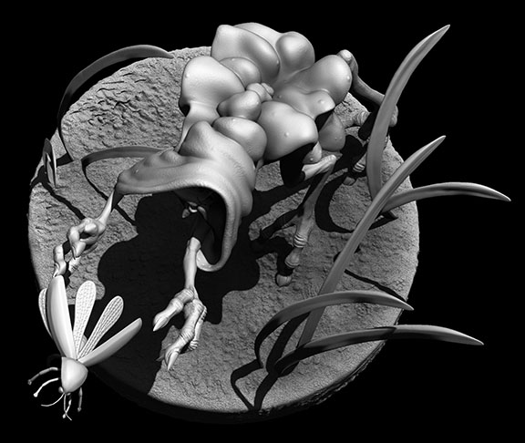
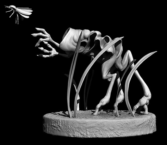
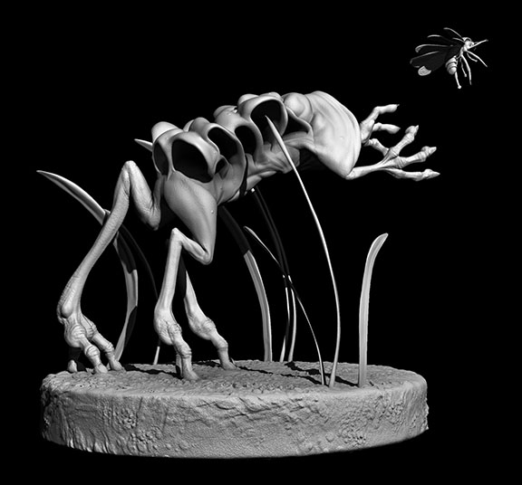
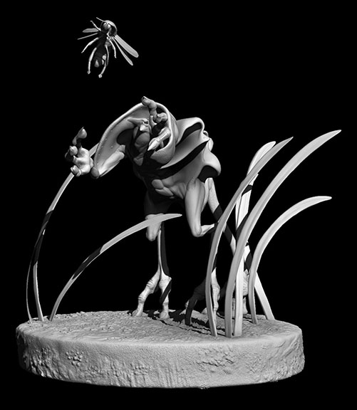
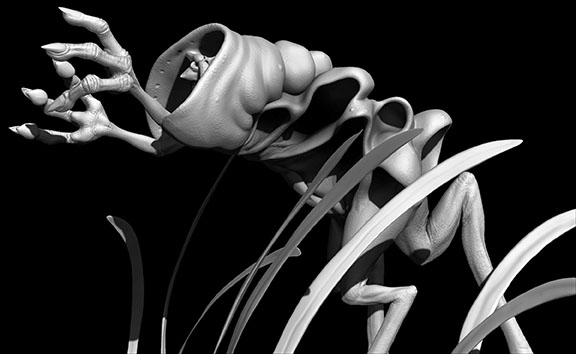
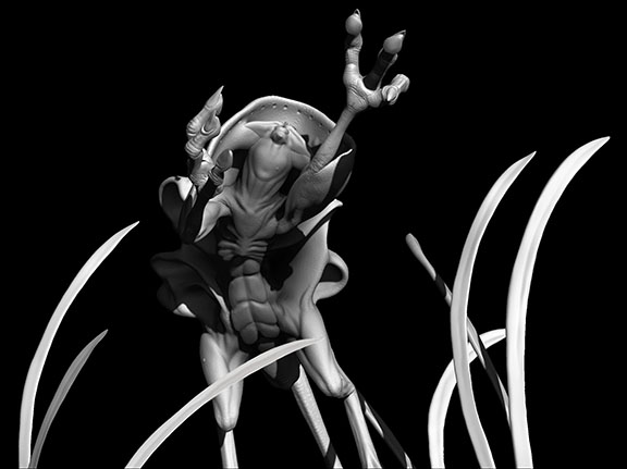
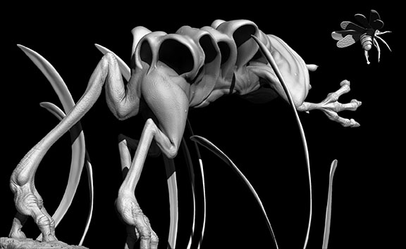
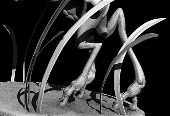
I present to you: Feles Velos, a.k.a. Felix!!!

I decided to put him on a dirt and grass base trying to capture a firefly. Poor Felix! All he wants to do is hug the little creature, but it's flying just beyond reach...

On a more technical note, there are multiple reasons that I consider him unfinished, despite how awesome I think he looks already. Reason number one: I want to texture him. I had this idea to create a hooded creature with bioluminescence, and Felix, here, is the result, but you'll never know that he has bioluminescence if I don't texture him. (Plus, now that I know all of the cool texture elements that I can create in Modo I'd like to texture something organic there - all of my thesis objects to texture are hard-surface.) Reason number two: His face isn't very detailed. You'll notice that in all of the images I rendered out of Felix and presented here, his face is featured only once. That's because his face really only looks good at one angle at the moment. This is mostly due to the fact that I caved in his eyeballs to create shadows for the iris and pupil areas. It's a sculpture technique that I've used before, and it generally works quite well, but, since Felix is a nocturnal creature, I wanted to give him gigantic pupils, and, thus, caving in his pupils essentially destroyed the roundness of his eyeballs. This threw off the whole face. From any angle other than the front his face just looks lopsided (which isn't helped by the fact that I sculpted him with a kind of lopsided smile). I will be able to fix this problem when I texture him, because when I do that I'm going to give him full eyeballs, with secondary geometry inside the clear outer ball shape to represent the iris and pupil (McKay showed us how to construct and texture an eye properly that way in class, and it looked so great that I just have to try it). Once there's an actual spherical shape to sculpt the eyelids and cheeks around, his facial shape should improve drastically. Reason number three: Felix's hood and the folds along his back are still dynamesh geometry. Leaving them that way just feels sloppy to me. I think dynamesh is fine for a digital sketch and sculpting odd forms that one plans to retopologize later (such as the shapes down Felix's back), but it doesn't seem appropriate to to put a full-blown, detailed creature model containing dynameshed pieces into one's animation model portfolio. Thus, I need to retopologize the hood and back ruffles and project their detail onto the new geometry. I'd actually really like to get all of Felix's fleshy parts as one piece, but I'm not entirely sure that I'll be able to do that without losing a lot of my detail work given the way that I constructed him. I have a few tricks up my sleeve that I plan on trying, though. I guess we'll see if any of them work...

  Moving on, I also got some new work in on my Juggler this week, but she is still by no means finished.

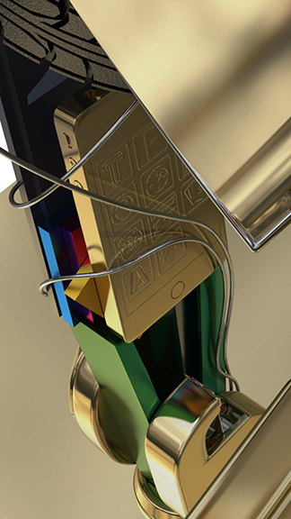
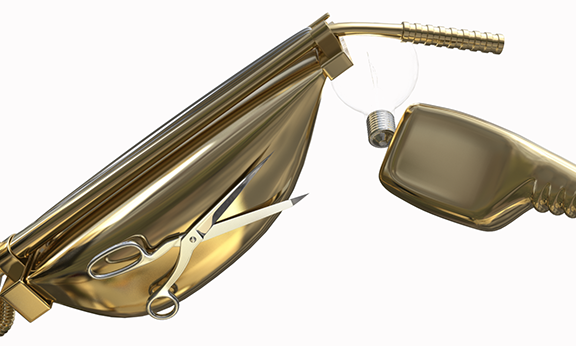
I finished my brushed/etched (I'm not sure, technically, what to call it) silver plug texture. Here's a close-up since the tonal shifts aren't very visible in the render of the entire hand above:

You can see the streaking of the color a bit better in this one. What you can't see, however, is the anisotropy that I put on it; that really only becomes apparent in moving images where the camera is panning across the surface. I'll be sure to put a shot like that in my video render for my demo reel when the model is finished.

  The UVing of the plug and outlet was a very long process. It doesn't really look all that complicated at first glance, but it actually has quite a few plane breaks that all had to be cut apart and sewn back together to get them to unfold properly. I think I spent 1 1/2 class sessions of nearly three hours apiece UVing just that plug and outlet. That wouldn't have seemed that long to me when I first started out on this project because I was much slower at UVing just a couple of months ago: 4.5 hours per piece was probably near average for me, but I've gotten a lot more practice in and am generally much faster at UVing now, so 4.5 hours on one piece was torturous. Once I finished that the brushed silver texture that I created (with McKay's help) worked like a charm. I had to lay out the UVed pieces by hand so that the grain flowed consistently in the right direction across the piece, but once I got that set up the rest was simple. I gave it a very slight bump to get some tonal variations in the surface texture, then I applied the anisotropy map (that I also created) to it so that it would catch the light the way that I want it to when the camera pans around it.

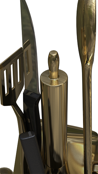
I then textured a number of other items, including the knife (above), which I think may currently have a bit too high of a gloss for the black titanium that I was trying to get the handle to look like, and the pin cushion, which still needs a normal map applied to it. I won't be able to put that on, however, until I sculpt on the pin cushion in ZBrush first. Nonetheless, I'm happy with how the texture of the pin cushion came out. I don't have any big plans to change it much once I get the normal map on (except for giving it a grunge layer of some sort, which the whole statue is sorely in need of - it's currently much too perfect). I added a Modo woodgrain texture layer as a bump map to the rolling pin and the wooden spoon models next to the knife. I had planned to create my own woodgrain bump for them in Photoshop, but the Modo procedural actually seems to work pretty well. I had to reposition the texture locators to the base of each model to eliminate an odd starburst pattern that occurred around where the locators were originally placed, but that was quite easy to do. After that, they looked pretty good. I'm not sure that I'm entirely happy with the spoon - the grain almost looks blurry to me in the render that I did - but it'll suffice for now.

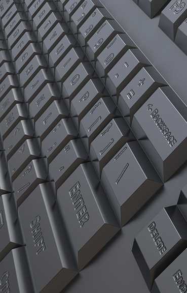
Another thing that I accomplished this week was the creation of a bump map for my keyboard:

I decided to texture the keyboard as if the key labels were etched into the metal. I typed everything out onto the UV snapshot in Photoshop, then turned the typing into a mask layer with noise behind it to give the letters the uneven surface that comes from etching metal. I'm debating about saving a version of my letter map as an all-black PNG with transparency where the letters and symbols are to use as a layer mask in Modo instead though. I would apply this mask over a new material that would be a copy of the steel material that I created for the keyboard with a very fine noise bump applied to it. I'm hoping that that might fix the fact that the noise bump currently in the letters is a little too coarse for my taste. I tried making the noise finer in Photoshop, but it's not so much a problem with the noise as it is a problem with the pixelation of the image map. The map is already huge, so I'm hesitant to try to increase the map size to make the bump grain finer, but determining the size of the bump and just masking it off in Modo might work better...

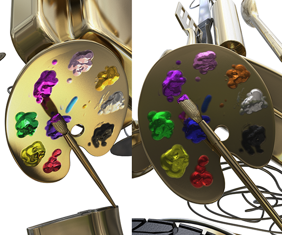
After the keyboard I moved on to my paint palette and brush. I sculpted them in ZBrush, used Maya's transfer maps to bake some normal maps of their details, fixed the normal map of the palette in Photoshop because the envelope that Maya created the normals from was too small and cut off the tops of most of the paint globs, then used the normal maps as guides for where to put color on the specular color map that I created and where to reveal that color on the layer mask map. The whole process worked pretty well. I blurred the edges of the layer mask map a bit too much, so the transition from color to ordinary bronze isn't quite right, but I should be able to fix that pretty easily by taking it back into Photoshop. I also learned something new: gamma correction. My blue "paint" was purple in the first renders that I did. It was then kindly pointed out to me that I needed to gamma correct my color map to .455, and viola!

The blue is blue, the orange is orange, the purple isn't pink... it's amazing!

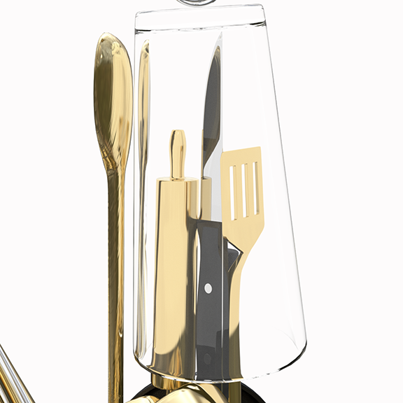
The last couple of things that I did in my Modo class on Friday were to create a label for my spray bottle and get some help from McKay fixing the glass in my scene. You can see in some of the above images where the vase is present that everything inside of the vase is completely blown out. The problem there was that I assumed that glass had a high spec, but it turns out that it can actually have quite a low one. I think McKay turned it down to something like 3% for me, and immediately you could see into the vase - finally! The problem then became (which has been the same problem I've encountered when I've tried to fix this issue myself) that the hidden environment was visible through the vase. I thought that this was a problem with reflections, and I didn't want to turn off reflections on glass, but it turns out that it was actually a problem with the refractions. McKay helped me switch the refractions off on the reflecting environment and on in the white background environment, and this was the result:

Before:

After:

It's beautiful! It's just what I wanted it to look like. And now you can also see the modeling that I did inside of the light bulb. I created two layers of glass to hold the filament wires, but you could never see them in most of the earlier renders that I did. Now they're plainly visible, and it makes me quite happy! 

And that's it. That was the extent of my finals for the semester. Now I have about a month long break, during which I shall continue to work on my Juggler so that, hopefully, she is finished before the summer semester begins. I actually hope to get much more than just her done, but we'll see how it goes - I don't want to skimp on the details now that I'm finally getting to them. And, of course, I will continue to work on Felix, but he may have to wait until I've taken a more formidable chunk out of my thesis. After all, I've only got about six months more to finish it in...

Directed Study - Week 14

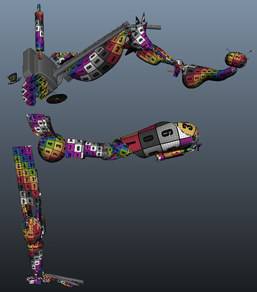
This has been an incredibly productive week. I don't feel like I've made a lot of visible progress on my Juggler sculpture, but I've done a ton of behind-the-scenes kind of work on it. I've UVed the majority of Juggler's objects this week. I still have a number of objects to go before I'll be totally done UVing, but when you've got a character made up of 60 different objects, getting the majority of the objects done is still a sizeable accomplishment. I haven't done any additional sculpting on the character since my update to last week's post about the finished, normal-mapped phone, but I'm happy with what I have accomplished this week. All of the colorful checker-patterned items in this image are now UVed:

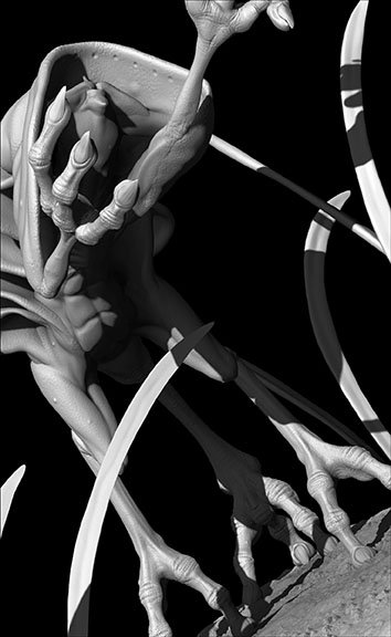
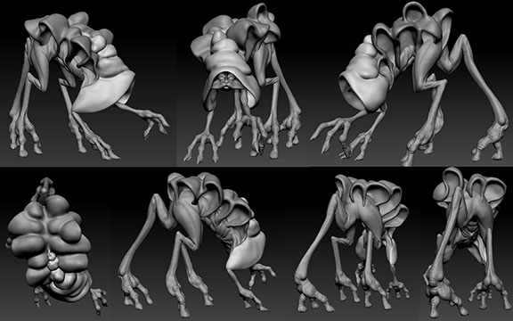
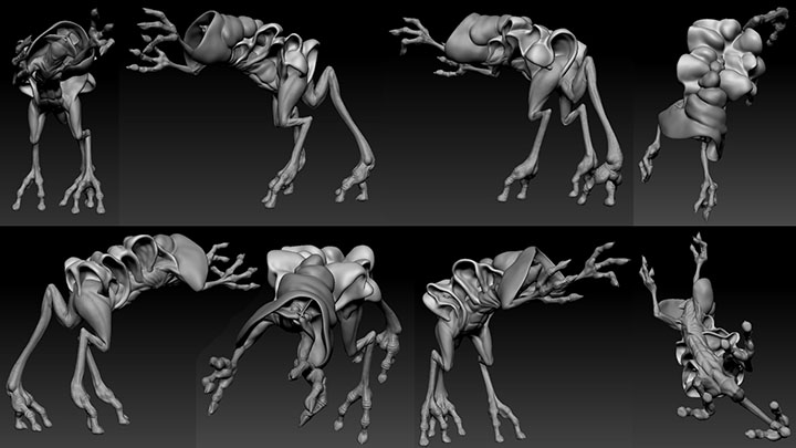
Additionally, I've made quite a bit of progress on my creature (whom I've dubbed Feles Velos, which is something like Latin for "veiled cat"). I sculpted his skin texture everywhere on his body except for his face, then posed him, then shaped the fleshy folds down his back and his hood using a dynameshed sphere:

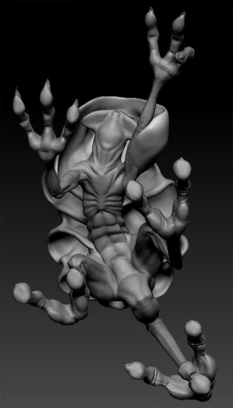
Then I saw this image:

I liked this view of him so much that I decided to try changing his pose, since most of the detail that you can see in this image would never be visible in a turn-table of the creature in this pose. I decided to try him rearing up on his three hind legs, and it worked like magic! I made one rotation of his front body from the point of his pelvis, and he instantly gained not only a better view of his detailed underbelly, but a very clear personality as well. As soon as his body reared up, his hands looked like they were reaching out to embrace something dear. All I had to do after the initial rotation was rotate the lower portion of his right arm to turn the palm inward and bend a finger joint or two and viola: instant personality created through body language!

I'm really happy with him. Of course, I now have to redo some of the fleshy folds down his back because they didn't transpose well, but I hadn't done any real detail work on them yet anyway, so it won't be too cumbersome to fix. I'm really excited to finish him. I think I'm going to give him a little dirt platform to stand on and have him reaching for a firefly. I really want to texture him eventually too, but that won't happen until after this semester's over. There is, however, only one week until that's true, so it won't be long now until I have the time, and, thanks to McKay's Modo class, I now also have the skill. I can't wait to show him off in his finished state!

Directed Study - Week 13

In the few days since my last belated blog post I feel like I've accomplished quite a bit.

The first thing that I did was export all 59 of the objects that comprise the body of my Juggler. I divided up the pieces that go directly into Modo and those that need some sculpting in ZBrush, then broke the ZBrush bound objects that will require polygroups up into quick select sets. I then brought the objects that require no additional sculpting into Modo and began texturing them:

I gave many of the objects a bronze texture, as that will be the dominant material for the sculpture. Then I began selecting individual items to texture differently. All of the objects will be some kind of metal except the light bulb and the vase, which are glass. Right now, in addition to the bronze objects, I have a brass pencil and post it notes; a steel keyboard and clock hands; silvery cords, scissors, CD, bulldog clip, tea ball, knife blade, and whisk wires; a cast iron frying pan and tire; and a green-tinted metal stapler and a red-tinted metal lamp shade. I'm currently attempting to make the plugs in the outlet that makes up a portion of the hand an etched silver, but to get it to work properly I'm going to need to UV the model first:

You can see how oddly the texture is behaving without UVs...

Here are two fully textured objects that I am particularly proud of:

In fact, I'm so proud of them that they have now been added to the "portfolio" section of this website. I was also recently  introduced to a unique way to get Modo to render something nearly equivalent to a wireframe, so I have applied this method to the scissors to get the "wireframes" shown above.

After my texture work I brought the rest of my OBJs (as well as the ones that I'd already put into Modo, for reference) into ZBrush. It looks like my quick select sets became polygroups just like I wanted, and everything's positioned just right:

I can't wait to start sculpting!

Last, but not least, I moved onto my creature. I layed out some muscles and major wrinkles and then began sculpting them. I'm in the middle of refining those elements (which are currently all a bit exaggerated), and then I will move on to skin details, pose him, and add the hood and carapace.

Directed Study - Weeks 11 & 12

Well, I've finally done it: I have fully completed the base mesh for my Juggler character!

This took me a bit longer than I had hoped due to a vacation on which I had a lot of fun but got no work done last week and an illness that severely inhibited my ability to work this week, but I've finally finished it.

The first thing that I did after posting for week 10 was finish the last few pieces of the housework-themed leg:

The scissors are probably my favorite piece in this whole character so far. They were much more challenging to create than I anticipated, but the extra work was extremely worth it. I love how they turned out. I've already done a render of them with a metal texture and they look like real scissors. I'm quite proud of them.

You may notice that  the scissors are different sizes in different images on this blog entry, and that is because one of the final things that I did before calling the base mesh officially "done" was enlarge the scissors to give them more of a presence in the design. Tareq suggested this in my most recent DS class this past Tuesday, and I think it was a good call. I didn't actually get around to enlarging them, however, until after I'd already gathered a number of screen shots for this blog entry, so they appear as different sizes in different images. The larger size as they appear in the bottommost images of the above collage is their final incarnation in the piece, however.

The next portion of the character that I moved on to was the kitchen-themed leg:

I made a rolling pin, wooden spoon, knife, spatula, spoon holder/vase, whisk, juicer, measuring spoons, bowl, foot piece, spinning plate on a stick, tea cup, and tea ball, and arranged them accordingly. The tea cup and tea ball are difficult to see in most images as they sit in a representation of a coverless pocket in the apron, but they're worth taking a look at. Maya doesn't really seem to like the fact I constructed an actual mesh of crisscrossing wire forms for the wire mesh part of the tea ball - it's a little too high poly and makes Maya chug a bit when it's on screen in smooth mode - but I'm excited about what I anticipate the final textured render of it will look like with the actual geometry there.

  The next thing I did was revise the supporting hand yet again. It now consists of a drafting table, plugs in a surge protector, and the rubber stamp that I built previously working together as the supporting part of the statue. I also finished the bulldog clip that I started a few weeks ago to fill the previous position that the rubber stamp was in.

I then moved on to the torso, building objects to represent hobbies and creating the geometry (thanks to retopology and adaptive skin tools in ZBrush) for the apron:

The most difficult piece on her back was the film strip. It was simple to build (though also a bit challenging due to it's poly-count being a bit high for Maya to enjoy smoothing), but very difficult to position. I used bend deformers to wrap it around the body, but I had a hard time deciding just where I wanted it to go, and the first few positions had some odd combinations of angles for the deformers to create. It was a piece I dropped and then went back to a number of times. I also decided to extend the vacuum cord at this point to fill some of the odd open space around the area of her left butt cheek. I considered a number of things to fill the space, but when I had placed stuff there in past weeks it covered up many of the details of the vacuum too much, so I kind of liked that space somewhat more open. The space is hidden in most views of the character anyway, but there was one angle in which that space was clearly visible and bugged me much too much to leave it completely blank, thus my decision to fill the space with the present, but minimally obscuring tangled vacuum cord.

Finally, I moved on to  the base meshes for the more human characteristics:

The Juggler face and attached torso:

And the Baby:

These pieces were particularly challenging for me because I haven't memorized a good method for creating geometry with proper edge flow for animating the face. I know how the edge flow is supposed to look, with rings around the eyes, the nose, and the mouth, but whenever I try to create it from scratch I end up with that result after a lot of round-about readjustments of topology. I think that I really just need to go back and study the videos that I still have of Tareq's method for creating facial topology from my Organic Modeling 1 class to get the process down pat, but, in the meantime, these faces were good practice. I also happen to think that they turned out pretty well, despite their less than efficient process of creation.

So, that's it. That's all of the work that I've done for the past few weeks. Now I need to get going on work for my Modo rendering class, which will consist of texturing all of the fully finished objects that require no ZBrush sculpting:

Then I will put in some more work on my Creature Design course ZBrush model, which I have only three weeks to finish, and then move on to sculpting Juggler pieces in ZBrush. It should be fun!

Directed Study - Week 10

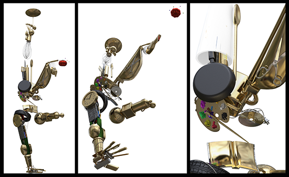
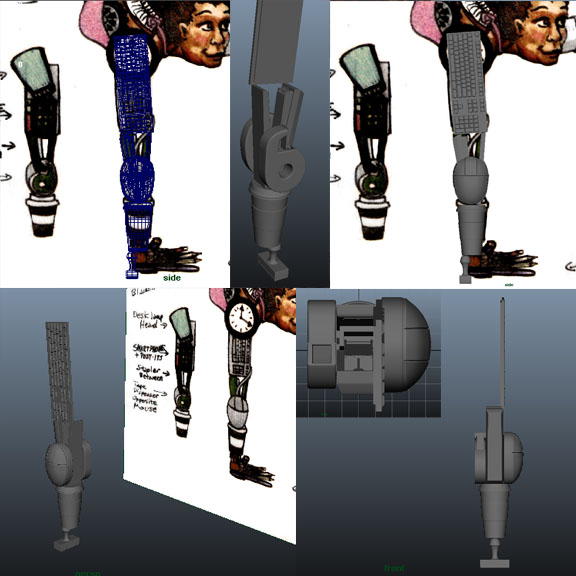
My Juggler model is coming along nicely. I should be done with her base mesh modeling by this time next week:

She now has the better part of three limbs, as well as a guide mesh locating her head and torso. I built a pin cushion, a mop, a feather duster, a light bulb (complete with filament), a spray bottle, a vacuum, a shopping bag, an open envelope, and a frying pan earlier this week and incorporated them into the character. I decided to change the location of the chair that I built; I'm going to replace the one currently serving as her wrist with a drafting table and move it, instead, to her left thigh. Also on her left thigh is my favorite prop that I have built yet: the vacuum cleaner:

I think the reason that I like the vacuum so well is because I got to use all of the new tricks that I've learned lately on it, like deformers and extruding faces along a path: I originally tried to extrude a nurbs circle along the nurbs curve that I created for the path of the cord, but every time I attempted to rebuild the curve so that I could get the extrusion to function properly the curve just exploded into something highly unmanageable. Rather than fighting with it, my roommate suggested extruding the polygonal faces of a cylinder along the curve. When he discovered that I'd never done that before he showed me how, it worked like a dream, and I've used the technique several times in the days since.

My next step for the Juggler is a few late additions to the left leg (ideas that my roommate and I dreamed up lately while shifting the location of the small armchair away from the wrist), the entire kitchen/cooking themed leg, and the "personal interests" themed objects along the torso. After that I will move on to sculpting the objects that need additional refinement in ZBrush, more UVing, and, finally, texturing. I'm hoping to finish the whole thing in two weeks time so that I can enter it into my school's Spring Show, but I think I'll be cutting it quite close and may not finish it on time. I'm still hoping, though!

I've done a small bit of texturing this week:

I wasn't really into either texturing or working on my creature this week because I was so excited about the progress I was making on my Juggler, but, as you can see, I did manage to texture two different versions of my light bulb, a cast iron and a generic frying pan, and one metal and one plastic spray bottle. I think these things are good practice for when I get around to actually being able to texture my Juggler as a whole, and I'll be able to reuse some of the materials in the full sculpture as well.

My only progress on my creature this week was to get the retopology finished. I finally managed to work on the topology without crashing every program the model touched, which was nice. 

The process took much longer than it should have, because the division level that you see in the images above is only one subdivision level beyond the topology that I plotted point by point on him in ZBrush. I should have made the divisions bigger, but I began at a certain level on the face, adhering too much to the existing detail, and was then forced to carry that level of detail throughout the rest of the mesh. It was a long and tedious process, but I learned a number of things while doing it, such as "start out bigger" and "don't use ZBrush for retopology if you have access to Topogun and 3D Coat". I believe it would have been quicker to learn and get used to a new program with more convenient retopology tools than it was to spend all that time covering the creature point by point in ZBrush. Oh well. Live, learn, and work more efficiently next time. :)

Directed Study - Week 9

I made good progress on my thesis modeling this week. I got held up toward the end of the week by a slew of technical difficulties, but my progress at the beginning of the week was quite pleasing.

I built base meshes for nearly all of the objects on the Juggler's left arm. The only item on that arm that I neglected was the base mesh for the baby's head and arm that will be seen inside the blanket swaddling: I haven't decided yet whether I want to construct those bits in Maya or ZBrush, so I've left them alone for now. A number of items on the arm will need to be sculpted further in ZBrush anyway, so I can get back to the baby parts when I'm closer to that stage.

I also made some progress on my Addict character this week. I altered his pose so that his knees are spread rather than together, as it looked more natural. He is supposed to have fallen to his knees in despair before having his epiphany, and having the knees together was too rigid for such emotion I think. On Tuesday I took him into ZBrush and began sculpting him as well, so that in his current state he appears thus:

I've kept him pretty low res at this point (I believe that he is only on his third subdivision level in the above images), but I've got good guidelines for refining his form at higher subdivision levels now. It's a start.

Beyond Tuesday I attempted to move on to retopologizing my creature for my Creature Design course and UVing the finished objects on my Juggler, but, as stated above, I had technical difficulties. I have never seen Maya and ZBrush crash so often in the course of two or three days as I have this week. Every time I began to make some progress, whatever program I was in crashed. The progress that I made on the retopology of my creature was so negligible that I won't bother to even post images here, and, as for the UVing of my Juggler objects, this is all of the progress that I managed to make:

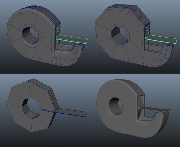
I UVed the cell phone, keyboard, tape dispenser, and tape roll models so that the checker pattern is as nice and straight as I could manage it, but that's it: three days and three objects. It's pretty disappointing. Part of the reason it took so long to do three objects is from the multiple program crashes I had to endure, and the other part was just me being slow. I was experimenting with the best way to UV these objects and also getting some tips from my roommate on how to UV efficiently in Maya. You see, I UVed the cell phone first in UVLayout, but a number of the pieces and/or their details wouldn't unfold nicely in that program, so I had to do a lot of tweaking by hand. The front of the cell phone, which is clearly rectangular, unfolded into something that resembled much more of an oval. All of geometry within the edgeloops surrounding the holes in the mesh of the body of the phone where the buttons fit into  was horribly compressed and none of the smoothing tools worked, even when scaled down severely to only affect the detail in those areas. I was forced to manipulate those areas on an individual UV basis, moving one point at a time to try to avoid squashing or stretching the geometry. I can assure you, it took entirely too long. (Oh, and UVLayout crashed on me about halfway through the process once as well, when I hadn't yet saved my work beyond cutting up the model, so that I had to begin the unfolding process all over again.) After that I thought that it might be quicker (and more accurate) to try UVing these hard surface objects in Maya, because when you "planar project" UVs over a rectangular surface in Maya, you actually end up with a rectangle, not the offspring of a rectangle and oval tryst.

UVing the keyboard went very smoothly, but the tape dispenser proved much more difficult. I had a  mini-lesson from my roommate on some of the tools that I was unfamiliar with for UVing in Maya, started working, and then the program crashed for the first time. For the next two days it kept crashing every time I felt like I might be getting somewhere. I also had trouble deciding where I wanted the seams to be on the tape dispenser, but in the end I put them mainly along the corners where the labels would break. Overall, I learned to delete my history and save even more frequently while UVing in Maya than I do while modeling.

I'm looking forward to a fresh start this week, with hopefully far fewer "fatal error" messages than I've otherwise recently been privy to.

Directed Study - Week 8

This week I UVed my Addict model, adjusted some of his geometry (which, of course, means I'll have to go back and adjust the UVs again, but, hey, at least I won't have to start completely from scratch on them I guess...), made a base mesh for my creature design creature in ZBrush (I really need to come up with a better name for him than "Creature", and began texturing some of my Juggler's objects in Modo.

 I spent quite a bit of time re-doing things on my Addict model last week. This week wasn't quite as bad, but I still feel like there must have been a more efficient way to work on this character... Oh well, I guess I'm learning and that's the important thing, right?

So, picking up from where I left off a few days ago with my Addict model progress, I brought my Addict model into UV Layout and arranged his UVs thus:


I thought it looked pretty good - there's a bit of stretching and compression (represented by the blue and red tinted polygons) throughout the mesh, but overall it's a fair layout. There's nothing particularly bright blue or red except perhaps the inside of his eye bags, but no one's ever going to see those anyway, so I called it good  and brought the mesh back into Maya to throw a texture on it and check it out. It was upon re-importing it that I realized I'd lost all of my Quick Select Sets I'd made (again), but, as I wrote in my last entry, I had a solution for that suggested too me before I got around to attempting to make the groups a third time (thank goodness). 

When I showed my progress to Tareq he suggested some more adjustments to the form before bringing it into ZBrush, so I adjusted the outlines of the eye sockets to make less of the eyeballs visible from the side of the face, expanded the shoulder poofs to come out further (which I'd originally intended to do in ZBrush, but it made sense to just add it into the base mesh instead), adjusted his posture so that he's sitting on his feet more, brought his neck, ear, and the back of his head back further, and added geometry to the front of his forearms where he has slits in his costume. Tareq also suggested that I bring the corners of the mouth back further, but I'm going to wait until I start working on the model in ZBrush to do that. I'll make the adjustments to the lowest level of the geometry, similar to if I were adjusting the base mesh in Maya, but it'll be much easier to see what I'm doing in ZBrush because I'll be able to hide the hands without having to detach them from the mesh.

This is my progress on the changes so far:

Then I put a checkered image on the character to check out the UV placement (which I never actually got around to before because I got distracted by realizing I'd lost all of my Quick Select Sets).

As you can see in the bottom right image, something funky happened with the UVs on the back of the head - the patterns all wiggly. The rest of the UVs are still pretty good, even with the extra adjustments I made to the mesh. There's some clear stretching where I added to the shoulder poofs and whatnot, but that should be a pretty easy fix. I'm not sure why the back of the head is wiggly though...

In any case, I'm not going to bother fixing the UVs anymore until I finish making my adjustments to the mesh. I am glad that I worked on his UVs already, however, because they allowed me to do this:

The different colored sections in the images are the different Polygroups created by the individual UV shells on the UV map above. I can hide and reveal the individual Polygroups at my leisure so that I can easily reach his face and whatnot while I'm working on sculpting him. I subdivided and smoothed him once in the bottom right images to reveal a slight problem I'm having: There are parts of the mesh that butt right up against one another that I need to remain butted up against each other, such as at the elbow and between the legs, but smoothing the mesh pulls them apart. I'm not one hundred percent sure how to fix that. I'm hoping that if I just crease those edges they'll remain together, but I'm not entirely sure that that wont interfere with the smoothness of those sections while I'm sculpting. I guess I'll just have to test it out and consult Tareq if it doesn't work the way that I want it to.

Beyond my Addict model I began the ZBrush model of my creature design this week. First I created a ZSphere Rig in ZBrush:


Then I made an adaptive skin out of it and turned on Dynamesh to shape the base form for my creature:

He's missing his hood and the fleshy shapes on his back, but I'm not going to add those to him until I get him posed because the pose will have a very large influence on their shape. The next step is retopologizing him so that the geometry flows with his shape and is not so difficult to work with.

The last thing that I did this week was work in Modo (as per usual). I began texturing some of my Juggler object models this week. I decided that the best thing that I can do as a project for my Photoreal Rendering class is to texture my Juggler objects both as metal objects that will go into my statue and as the actual objects themselves for portfolio pieces. This idea will allow me to make more materials than just the metal and glass required for the Juggler; it will give me some extra material for my portfolio; and it will give me more time to finish my Addict so that I'm not rushing to finish his modeling just so that I can have a patterned model for the course.

The first Item that I worked on texturing was the chair:

It still needs a lot of work because the leather will require some image maps to make it actually look like leather and I haven't manged to get the grunge quite right yet on the bronze version, but it's a start.

I then moved onto the pencil and the stapler:


I'm pretty happy with both pencils as they are. They eraser on the non-metal one may need a little work, but it's mostly there. I'm also happy with the non-metal stapler, but I'm not quite satisfied withthe metal one. The green metal either seems to be too shiny or too dull no matter what I do: I can't seem to find a middle ground. I think that I'm going to leave it as it is for now and come back to it after I've had a bit more experience with the other items.

The last thing I worked on was my clock. I had a bit of an issue with flipped normals on the clock hands. The hands stayed black unless I had them emitting something like 200% of the light going into them. I went into Maya and conformed the normals on them to the rest of the mesh. Then I turned on "Display Face Normals" and checked them out and they looked correct, so I ruled the normals out as the problem and asked McKay what was going on. He hit "F" on the keyboard in Modo and viola: perfect clock hands. "F", it turns out, is "Flip Normals"... The normals were the problem after all. It seems like it's always something simple like that when you actually bring up a problem you're having to the professor. You keep fiddling and fiddling with an issue trying everything you know to fix it, getting more and more frustrated all the time, and as soon as you ask the professor it's either something they can fix with a single button-click or you can't get the problem to recur while they're looking at the screen - suddenly everything just works fine and you feel like an idiot... Oh well. Anyway, here are the clock renders:


The bottom right one is the only one rendered after the normals were flipped. The hands should actually match the hour markers.

Directed Study - Week 7

Whew! What a week! I'm posting this blog entry half a week after midterm week has ended and I'm STILL exhausted!

This past week I decided to change up what I'm working on for my thesis project a little bit: I built a base mesh for my "Addict" character instead of continuing work on either my Juggler or my gecko. I need something to texture for my Modo rendering class and I thought it might be quicker to start and get to the finish of a new character rather than continuing with the multitude of objects that I still need to build for the Juggler. I have Juggler objects that I can texture for the class in the meantime until I bring one or both of the characters to completion, but I thought it might be beneficial to get a move on with the Addict. As always, this model is taking longer to get going on than I wish it to.

The Addict:


These nice screen shots of my Addict character model don't adequately relay everything that I went through to get the mesh to this point. The steps included: 1 initial mesh build, 1 ZBrush Retop, 1 round of modifications that led to me not being happy with much of even the retoppped geometry (clearly I jumped the gun on the retop and did it much too early), 2 conversations with Tareq pointing out to me all of the problems with the topology and portions of the overall structure, 1 portion of time spent selecting all of the geometry in specific patterns to create Quick Select Sets which would have become polygroups in ZBrush, 1 extraction of the hands out of the mesh so that I could see the face in Maya to fix some geometry problems around the eyes, 1 combine and merging of the hands back into the body that caused the Quick Select Sets I'd created  to cease functioning (which I failed to recognize until it was too late to go back), 1 session spent trying to work with and rebuild the existing geometry on the forearms to get the mesh more evenly spaced out, and 1 deletion of forearm geometry followed by a rebuild (that I realized later would have been much easier to do in a way other than that of which I did it) to finally get the mesh to the state in which you see it above. After it reached this state I remade my Quick Select Sets:

Then I exported a .obj file to UV the model, at which point the time period starts to bleed into week 8 of Directed Study, so I'll save the images and recap from that point on for this coming week's blog entry with the exception of one thing: I realized after UVing that I'd saved the UVed mesh as a new .obj and re-imported it into Maya where it became obvious that, once again, I'd lost the latest round of Quick Select Sets that I'd created. :( Luckily, my roommate pointed out to me the "Polygroup by UV" feature in ZBrush, so, since my UV groups coincide quite nicely with the Quick Select Sets I'd attempted to create anyway, I shan't bother making them a third time.

Moving on:

After the work on my Addict character this past week I was forced to abandon all work on my thesis project for a few days in an effort to finish my large maquette for my Creature Design course. I worked for three days straight spending all of my free waking hours sculpting a mix of Super Sculpey and Sculpey Firm clays to create this: 

I'm quite happy with the bottom half of this piece (though Micah said that the transitional areas between the palms and fingers and foot pads and toe areas could use a little bulking up) but I ran out of time to perfect the detail the way that I wanted to on the top, fleshy areas. It's ok, however: I believe that I've figured out a way that I can still add the desired detail even though I've already cured the clay. I intend to add an extremely thin layer of diluted Sculpey clay on the fleshy top parts and sculpt detail into that - it'll also allow me to round out some of the edges that got a little too squared off - and I can always add more undiluted clay anywhere that it may be required for additional bulk as well. I can't dig into the existing sculpture or move around any pieces that are already on the model, but there's actually a lot more wiggle room than you might expect for minor tweaks like high-level detail.

Last, but not least, of my Directed Studies this (and every) week was my Modo rendering class. I did none of the assigned texture practice for the week because I was too busy sculpting, but I did make good progress on what was going to be the midterm in class:

McKay's original intention was for the class to photorealistically texture this fruit bowl model this week as a midterm project, but something happened to the file in transit to the school that seems to have made digitally painting it virtually impossible without much extra work that's not part of the course topic. As an alternate assignment, he asked us to at least dial in the base materials for the objects as well as we could without digitally painting in the details. The above is as far as I got during classtime. It's not half bad if I do say so myself. It could still use some work, for sure, but it's pretty close to as good as I can make it using only basic materials. I'm going to move on to texturing thesis objects this week rather than attempting any more work on a model that's not my own, but I still liked the fruit bowl well enough to post this little bit of texture work up on my blog this week.

Now: back to modeling.

Directed Study - Week 6

I've had another busy, yet productive, time this week.

I built another few items for my Juggler character model.:


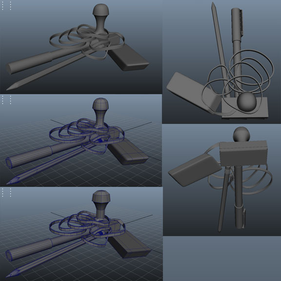
Then I got hung up for about two days on an unexpected issue that I was having with her design. I had originally designed the character to be supported on one hand made of office supplies: Her fingers were to be made up of pens and pencils; her palm was a pile of rubber bands, tacks, and clips piled against the side of a rubber stamp; and her wrist was a to-go paper coffee cup which then yielded to the rest of the sculpture above. I made the pens and stamp last week and have had the coffee cup for awhile now, but began working on the rubber band pile just this week. I planned to build it up piece by piece by duplicating the rubber bands and arranging them one by one. Eventually I decided that this was madness: it'd probably take me about a week to build a piece of the character that takes up approximately one percent of her total mass - and it's not even anything anyone would likely be able to see close up in any render or animation that I might use the character in anyway. So, I thought again. I took one of the rubber bands I'd made in Maya into ZBrush and made it into an Insert Mesh brush. I clicked-and-dragged about one hundred times and finally had something resembling a messy rubber band pile. I started using ZBrush brushes to clump it together a bit more and messed the whole thing up. I reverted back to where the tool was at just after I'd built it - before I'd begun moving things - and tried again a little more gently. I then exported it back to Maya and began manipulating the geometry there so that the rubber bands didn't intersect where they were in plain view. I noticed that Maya wasn't responding very quickly, then looked at the poly count of my scene and realized that it was outrageous due solely to the rubber band pile. I'd exported them from ZBrush on the lowest resolution, but  the number of times that that one low-res rubber band had been repeated for that single small pile still made the overall polygon count a little too high for my liking. Not only that, but many of those faces weren't even visible because they were lost in the overlapping geometry in the middle of the pile. So, I thought again. I went back into Zbrush and tried dynameshing the pile, hoping that it would just merge all of my overlapping center geometry into a solid form, which it seems to have done, but it also smoothed the outer rubber bands to such an extent that the whole thing turned into an utter mess. If I'd been trying to model a hairball it might have been perfect, I suppose, but that is distinctly not what I was going for. I tried sculpting a solid center in ZBrush that I could have a few random rubber bands protruding from by placing them carefully in Maya, but that didn't pan out too well either.

Eventually, I scratched the whole rubber band thing and went back to the drawing board. One of my roommates suggested that I support the other half of the coffee-cup-wrist with an on-end bulldog clip rather than a rubber band pile. I started modeling one of those, and then got the idea to have the palm of the hand as the computer mouse with the pens protruding at an angle toward the ground like spread fingers on top of it. I really liked the idea of the mouse as the palm, because it's then sitting in the anatomy of the sculpture in direct relation to where it would be positioned during use by an actual human. I then thought it would also be a great idea to have the whole sculpture sitting on a small platform with a mouse pad on it directly under the hand - something with more area to anchor it directly to a supportive ground plane. I rearranged objects in the sculpture to fit this new vision, then realized that it only created an even more awkward gap between the sloping surface of the mouse and the bottom of the coffee-cup-wrist that I'd have to fill. I considered the bulldog clip again, but decided to sleep on the problem before commiting to anything.

While lying in bed that evening I was struck by sudden inspiration - I'd forego the mouse-palm thing and support the entirety of the bottom surface of the coffee cup on a small desk chair. It'd be a much more solid surface for the cup to sit on, and, since the rear of a desk chair has a fairly flat vertical plane, I could place another solid object (like the rubber stamp I'd already built) right up against the back of it to anchor the statue a bit more, then have the pens and pencils extending off of that. The desk chair can solve two problems at once: number one is the obvious support issue, and number two is a kind of clarification that the objects making up the sculpture are not meant to be to scale. It's been an idle concern of mine that the unnatural scale of the objects could be taken as a mistake rather than a design choice ever since one of my roommates asked me if the objects were meant to be to scale. I had thought that was clear already, but then I noticed how many were near enough to scale that it could foreseeably cause confusion and I became concerned. A clearly undersized desk chair integrated into the design eases my concern on this count. I built a quick mock-up of a desk chair to test its placement in the design and am happy with the direction the design is going now.

I still need a little bit of something to fill up space in the palm, but, since that section of the figure doesn't have the issue of having to directly support the rest of the sculpture like the area under the coffee cup did, I have a lot of options and am confident that I can find a good space-filler - perhaps that bulldog clip that I've started building...

Another object I'm working on for the Juggler is a smart phone. I'm modeling it after my iPhone since it's a handy reference that I happen to always have on me. I've had a bit of trouble modeling it because it's one item that I can't follow Tareq's extremely good advice on and break into pieces. I mean, I can break it up a bit, but the places that I can separate it are not the places that are particularly problematic. The difficult areas are the buttons, which require nice round holes in a piece of solid, perfectly smooth geometry. I've had a bit of trouble with holding edges for the rounded corners of the overall phone shape interferring with holding edges that I need to add for a button, or holding edges for the screen messing up the rounded corners. I've already had to scrap one version of the phone and begin again. I made the screen too small and when I tried to enlarge it all of the holding edges started reacting to each other unfavorably and I lost the smoothness of the overall shape. It started pinching in some areas and bowing outward in others:

I started over again and it seems to be going fairly well so far, but I do still have more buttons to add, so we'll see how it goes...

In other news, I made a bit of progress on my large creature maquette this week:

I had hoped to get all the way through modeling the entire form, leaving just the skin detail for this week, but I was a bit too busy last week to manage that. It took quite a while to get the limbs as smooth as they are: every time I tried to smooth out the clay the wire inside started to break through from the opposite direction and then I had to add more clay and smooth that out. I didn't even begin to attempt shaping or smoothing the fingers and toes. I smoothed out the body and got one half of the back ruffle (for lack of a better word) on, but I still have the other half of that, the hood, and the face to sculpt before I can move on to any detail texture work.

On the other hand, I managed to get much farther than I anticipated on my Modo homework this week. The assignment was to practice our skill at judging material properties by creating 50 textures. I anticipated that I might finish about half of that amount since my other work during the week left me with only a day and a couple hours of Creature Design class time to work on the textures in. I finished all 50. I was (and still am) quite impressed with myself. The materials still aren't perfect, but they're not any worse than the ones I've created in my previous weeks in the course, and, since I finished over three times as many in the same amount or less time than I've devoted to the course's assignments in previous weeks, I mark this as significant progress. This week we move on to texture painting and fur styling, and soon we'll progress to applying textures to our own models - I can't wait!

For now, here are this week's textures:

More next week!

Directed Study - Week 5

I feel that I have made a lot of good progress on my thesis modeling this week. I’m still not as far as I would like to be, but I managed to finish a couple more Juggler object models before my GDS with Tareq this week and then I actually had time to continue working on thesis models between Tuesday and Friday, which has been otherwise unprecedented this semester due to having two labor-intensive courses back-to-back on Friday. I usually spend all of Tuesday through Friday either drawing or sculpting for Creature Design or rendering out materials in Modo for Photo-Real Rendering, but this week I got to throw some actual modeling work in there as well.

        So, first of all, what I brought into my GDS this week was a finished stapler model, a tape dispenser, and an arrangement of all of the objects that I’ve created so far where they will fit into the Juggler figure.

Tareq seemed to approve of my models and recommended that, rather than smoothing all of the objects before bringing them together into the figure, I just leave them all low-res and view them with smooth-preview on so that the scene doesn’t become too polygon-heavy. So, in class I switched out all of the high-res models for low-res ones and then moved on to modeling a rubber stamp, eraser, and a few rubber bands for the Juggler’s hand. 

When I got home from my GDS class I continued on with my rubber bands, modeled a pencil and a pen, and then proceeded to finish the major part of a model that I’m doing as a collaborative project for a friend (the cube-dragon that I mentioned in my last blog post).

I’ve also modeled a clicker pen and a white-out pen and added them to the hand so far this week, but I haven’t done any screen-grabs of them yet.

  When I list the assets I’ve made this week it doesn’t seem to me like I’ve made all that much progress actually, but, really, I’m nearly done with the support hand on the statue and over halfway through the supporting arm. Plus, I feel confident that by the time I go into class on Tuesday morning I will have the entire arm done. As I said, I’m done with the major part of my collaboration project model: I just have a few hours’ worth of clean-up work left. I have some more sculpting to do on my large Creature Design maquette (see pics of my progress below!), but I probably won’t get to that until Tuesday or Wednesday. I’ll be working on Modo renders practically all week in all likelihood, but I’ll have plenty of time to work on other things between renders. And I have absolutely no plans this weekend. To some that might be pathetic, but for me it’s cause to celebrate all the great work time I can get in (it’s the cost of being a grad student – well, that and, you know, the actual cost in tuition…) All in all, it’s shaping up to be a busy, yet productive week.


Creature Design - Large Sculpture Armature:

 Large Maquette Stage 1:

Directed Study - Week 4

I didn’t get a whole lot of work done on my thesis this week because I got distracted with other projects. I’m collaborating on a friend’s animation thesis by building him a 3D model of a dragon built entirely out of cubes. I also had an 8 inch maquette to build for my creature design course and 15 new textures to create in Modo. Despite this, I did manage to get a couple of models done for my Juggler character. I finished the computer mouse that I began in my GDS class last week. I had started building it in one piece but was having trouble with the smoothing where the corners of the buttons met. The geometry kept pinching no matter what kind of holding edges I managed to get into the mesh (and sometimes those edges caused the pinching). Tareq suggested that, like the keyboard, the mouse would be easier to model in multiple pieces. I took his advice and it seems to have been successful:

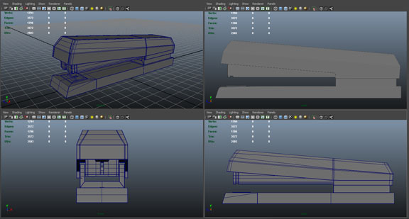
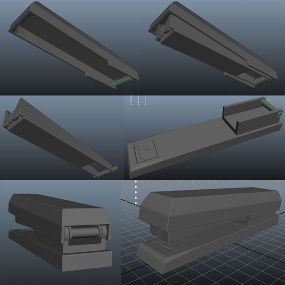
I also modeled a “to go” coffee cup and started modeling a stapler.

That’s all for my thesis, I’m afraid, but I did get some useful work on my creature design in by building the small maquette.

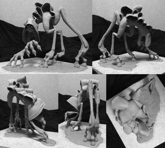
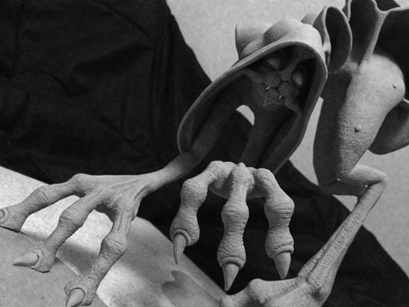
I changed the silhouette of my creature a bit before starting in on the sculpting. I tried to change the proportion of the back leg compared to the front two legs according to Micah’s request. This is what I came up with:

#1 was my favorite. I shortened the thigh area of the creature’s back leg, thereby elongating the lower portion so that it would continue to reach the ground. I also moved his foot back just a bit to make him look a little sturdier on his feet. I submitted thoise six options along with this image showing a comparison of the silhouette, a top view sketch to indicate limb placement, and a quick sketch of the creature's walk cycle:

Micah approved the changes, but requested that I play with the silhouette of the billowing folds along the back as well. I decided to sculpt the maquette and play with that form in 3D rather than 2D. It was a mistake.

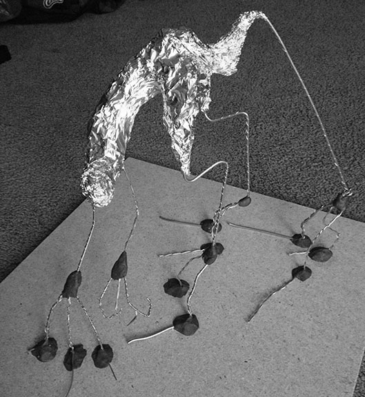
I built my maquette out of an air-dry clay that I’ve been wanting to try for a long time. He has a nice wire armature mounted in a base of cured Sculpy III and a body made from La Doll clay. I referred to the 2D design when I built the armature, but after that I left the sculpt up to memory and intuition. That was another mistake. I spent a full day and night working on him and was quite happy with how he turned out when I finished him. The next day when I compared him to my color design, however, I wasn’t so pleased. His head is down too much and his face is too far forward in his hood. The billowing folds along his back are also much too small. I want them to be deep and shadowy. These are shallow and much too regular. The feedback I received in class was that the back leg and foot still needed to be a bit sturdier and I need to have his body twisting a bit more to break up the very straight-up-and-down form he has when looking at him head-on.

        The last of my projects this week was 5 Modo fur materials, 5 displacement materials, and 5 bump ones. McKay showed us how to use fur, displacement, bump, and luminosity in the class before this particular assignment was issued and I got some fun results:

The luminous material was created by playing around with luminosity and a gradient editor, and McKay took us through the creation of the lava step by step.

        For the homework, however, I once again, spent many hours trying to get things looking good and had less than thrilling results:

I was quite pleased by my sea urchin spines and cast iron, and amused by “the world’s strangest Lego”, but, for the most part things just didn’t look quite right. There are a couple of textures in those images (“Moss on Rock” and “Other Grass”) that I created during the most recent class after the homework was due. Those came out a bit better because McKay showed us at the start of class how to have a different material on the fur and the surface from which the fur is protruding. My previous “Moss” looked like it was growing out of bright green plastic because the fur was getting its material properties out of the surface from which it was protruding. I like “Moss on Rock” much better. I still need a lot more practice to get things to a point I’m really happy with, however.

Directed Study - Week 3

This week I spent a lot of time adding edges to my keyboard in Maya. I built the basics of the keyboard in Modo to familiarize myself with Modo’s modeling tools, but eventually I just wanted the keyboard done and, since I couldn’t figure out beveling in Modo, I exported it to Maya to finish my work on it. Unfortunately, when I beveled the edges of the keys Maya created tris in the corners where the bevels met on the surface of the keys and n-gons down between the keys. In order to fix these topology issues and keep the whole thing quads I used the split polygon tool over and over and over again to turn the tris and n-gons into quads around each and every one of the 104 keys on the keyboard. It was A LOT of edges to create by hand…

When I went into my GDS class on Tuesday Tareq brought up an excellent point that I hadn’t thought of during all of the time that I was building the keyboard and adding edges: I didn’t need to make it all one piece. It doesn’t have to deform (bend or stretch) at all, so the model doesn’t have to be watertight. It can just appear to be one piece and be perfectly fine. (Forehead: meet Palm) If I had thought of that earlier I could have fixed my bevel issues once and duplicated and resized the one key as many times as I needed to. I also wouldn’t have needed to spend the time that I did dividing the board as evenly as possible to create the grid from which I extruded the keys in the first place: I would have had one consistent sized key that I could duplicate and/or widen at need. Instead, I ended up with a lot of extra geometry to create the uneven “grid” of keyboard keys (because the edge loops that I created to define the boundaries of each key had to flow through every other key in its path regardless of the other keys’ boundaries to keep quadrilateral topology) and a lot of extra time spent using “Split Polygon”… Here’s the resulting model:

My Creature Design work this week has gone rather well. Our assignment was to create a fully rendered color illustration of our creature design. I took the most recent silhouettes that I liked from last week and refined a few into clearer designs. I eventually found, to my own surprise, that the design I liked best actually stemmed from one of the last two silhouettes that my instructor had chosen, without the luminescent tail that I’d really wanted to include. I had been surprised that he had chosen the silhouettes that he did because they seemed to be among the more conservative designs on the page – I thought that many of the others had much more interesting forms to them. When I started refining the designs, however, I changed some of the proportions of the initial silhouette and voila! It worked! I had created a creature with a built-in hood hiding his face as I’d wanted, but with more interesting proportions as the instructor had requested. I took the new design and drew a few different versions of it with different surface forms to create a similar kind of silhouette and eventually came up with the idea of a form like a fleshy cape billowing down his back the match his built-in hood. I am very pleased with it.

I emailed the various designs to Micah and he approved the one that I wanted, so I continued on with the digital color version:

Then I did some hue adjustments to try for some other color combinations, but I think I still like the original best. 

After seeing the finished illustration in class, Micah asked me to take some of the yellow bioluminescence from inside the hood of color creature #2 and add it to creature #1, and also to work on the hind leg proportions a bit more.

 Last but not least, for my Photo-Real Rendering class this week I created a few different textures on a material ball provided by the instructor. We were supposed to create 2 materials primarily defined by each of the following surface properties: Diffuse, Specularity/Reflectivity (which is, surprisingly, the same thing), Transparency, and Subsurface Scattering. I spent an entire day rendering a number of materials, but I’m only marginally satisfied with the results - and it’s not Modo’s fault - it’s my own ineptitude at defining materials that’s the problem. I need a lot more practice with this.


Directed Study - Week 2 - Modo and Creature Design

The homework for my Hyper-real Photo Rendering for Modelers class this week was basically “get familiar with Modo”, so I used my time for that course to build a keyboard for my Juggler thesis character. Modo’s modeling tools are kind of hard to get used to after all of the time that I’ve spent in Maya and ZBrush lately, but I really think that it’s worth the effort to have familiarity with yet another program that I can add to the “Skills” section of my resume. I couldn’t seem to get the “julienne” tool to work properly, but perhaps I just don’t understand the way it “properly” works... I was hoping that it would make a series of parallel edge loops at a constant interval in the geometry so that I could extrude the keys out of it, but when I actually applied the tool the scale seemed to be very different from where the lines that I took to be guidelines were showing on the model. I ended up just using the slice tool to put in edge loops at as regular of intervals as I could manage.

I spent quite a bit of time creating designs for my creature design course this week. I made about 50 different designs, emailed them to my teacher, Micah, and he chose 2 and told me to keep going.

(He liked 39 and 21.)

So I made 43 more designs and brought all 93 into class on Friday:

He chose 39, 69, and 72 as starting points for me to keep developing my design more. He requested more interest in the negative space around the character. I wanted to honor this request because I’m assuming that he knows more about good creature design than I do, but I’m also rather taken with the idea of a creature with a kind of built-in hood around its head. I like the idea of a creepy “reveal” feature to my creature design, so I decided to try and incorporate that into something with a more interesting silhouette to please both of us.

So, after even more drawing, I ended up with these silhouettes:

He liked 11 and 13, which really surprised me since 11 is pretty much a stylized brontosaurus and, while I like 13, I don’t think it’s as interesting as some of the others on the page. I really like the idea of my character having a tail with a bioluminescent “lantern” on the end of it like an angler fish, and number 2 on the page is exactly creature number 13 with said tail, so I think that I’m going to work with 13 and some of my other favorites on the page (7 and 18) to refine them more and see what kind of feedback I get.

Directed Study - Week 2 - Gecko

My classes are going well. It’s early in the semester and I’m already busy. I’ve gotten quite a bit of work done on my gecko character model. Working in the GDS setting has really boosted my productivity on my thesis models. The first character I’ve begun to model is my gecko. I started my work on him in Maya, and have since progressed into ZBrush. Unfortunately, I did a lot of unnecessary work in Maya. I had a plan when I was designing my gecko that I would build a base mesh for him in Maya and then export him into ZBrush and use the retopology and adaptive skin tools to create his sheet metal panels. By the time I began working on him, however, I had completely forgotten that plan… Instead, I built a solid base mesh and then started extracting faces and extruding them outward just a bit to add some thickness.

There are a few problems with this method. The first problem is that when I try to move the extruded faces to add thickness the thickness is not necessarily the same in every direction: If I pull the faces up on a surface that curves down around the side then the top part of the panel gets thickness but not the side. If I then move the faces sideways to give the side some depth, then the far edge of the top is now angled toward that side rather than remaining straight up and down. If the surface curves in yet another direction then things are further complicated… Basically, there’s quite a bit of extra work to keep the thickness of the panels equal along curving surfaces beyond just simple extruding. The second problem is that the edges of the faces I extract for the various panels all butt exactly up against one another, but I don’t need them to butt up against each other: I need them to overlap. This means that I am having to manipulate the edges even more than just the extruding process requires, because now I have to extend them in every direction to overlap where and as they should.

Doing this kind of thing in ZBrush is much quicker and produces more consistent results. If I take a base mesh built in Maya I can make a rig out of it and use ZBrush’s retopology and adaptive skin tools to create panels of equal thickness on all sides no matter how the surface curves and, in addition, all of the panels can have exactly the same thickness. (Note: It is entirely possible that there is a way to extrude evenly to a consistent thickness around multiple curving surfaces in Maya, but if it exists I don’t know it yet.) The process is as follows: Rather than extracting the faces that I need for each panel and extruding them as in Maya, I use the Maya base mesh as a rig for creating new topology but, instead of retopologizing the entire thing, I retopologize panel by panel. I basically draw a type of grid over the area where I wanted the panel (including some extra room for the panel overlaps) and then tell ZBrush to create an adaptive skin of a predetermined thickness. The program creates a piece of geometry with the set thickness that follows the surface of the rigged object (the gecko base mesh) with faces on that surface for every quadrilateral in the grid that I created. I then save that piece of geometry and move onto the next panel. I also use symmetry while retopologizing so that both sides are created exactly the same and I only have to cover half of the surface manually. Eventually, all of those different skin panels are combined as subtools in a single .ztl file where I can manipulate them in accordance with each other. I still have to do a little clean-up work on the ZBrush panels: where the overlapping portions of the panels were created the form of the base mesh was followed precisely on each piece, so I have to move the edges so that the geometry of each panel no longer permeates the space of the geometry of its neighbor. I prefer this type of clean-up work to the type that I had to do in Maya with the other process however because using the Move brush to nudge the edges of the panels in ZBrush is a much more organic process than selecting edges and vertices in Maya.


So, to recap, my gecko model creation process has gone thus so far:


I started a base mesh in Maya:

I spent a whole lot of time making panels that I’m not actually using anymore:

Then I came to my senses and finished the base mesh to ready it for export to ZBrush:

I mapped out the divisions between panels by painting on my base mesh in ZBrush:

Then I created the sheet metal panels using retopology to produce adaptive skins and combined them as subtools into a single Ztool:

Now I just have to adjust the panel edges so that the different panels’ geometry no longer penetrates that of the neighboring panels, create the base the gecko is going to be clinging to, pose the gecko, and then sculpt in the details.

Directed Studies - Week #1

This week was the beginning of my sixth semester at the Academy of Art University, and my first semester of Directed Study courses. I’m taking three courses this semester, and all of them are Directed Study (DS for short). My first course was a Modeling and Shading GDS (Group Directed Study) with Tareq M. on Tuesday, followed by “Creature Design and Sculpting” with Micah M. and “Photo-Real Rendering for Modelers” with McKay H. on Friday. After the first round of classes I have very high hopes for this semester.

I was able to get quite a bit of modeling for my gecko sculpture done in Tareq’s class, despite the fact that it has an 8:30 am time slot. When left to my own devices I always work better at night, but the GDS setting lends itself to productivity somehow. Tareq seems very knowledgeable on both his subject and the industry in general, so this should be a great class.

I’m really looking forward to the coming weeks in my Creature Design course. I’m using this course to create a portfolio piece rather than applying it directly to my thesis itself since I’m very interested in potential creature design jobs and, yet, actual organic creatures are one thing distinctly lacking in my thesis project itself. I suppose you could technically classify my sculpture characters as “creatures” if you stretch the definition a bit, but I tend to think of “creatures” as primarily organic beings, whether they’re alien, animal, humanoid, or otherwise fantastic. I would like to produce a really well designed and modeled example of one of these. My homework this week is at least 20 thumbnail sketches for design ideas. Then, in the following weeks, we are going to narrow down and refine our designs until we produce the best design that we can. This is what I was hoping for from the creature design course that I took last semester but didn’t get. I’ll admit that I got some good experience with animal anatomy from that course, but there was no time to refine designs at all for that course. I was harried enough with the workload trying to wrap my head around learning and adapting the anatomy of such different creatures as dogs and monkeys and birds without designing 20 thumbnails for each type of creature we designed, and I’ll be the first to admit that my work suffered without the brainstorming time. I didn’t push my designs enough. The course I’m in now is all about pushing the design. This is definitely something that I need to practice more, and I’m certain it will benefit all of my design work in the long run.

The last course of my week, Photo-Real Rendering, already blew my mind today. I watched my instructor texture and render a 3D model of a diamond ring to look Photo-Real in five minutes or less in Modo. I’ve done a little bit of texturing in both Maya and ZBrush (not a lot, I’ll admit, but enough that I have a fair grasp of what those programs are capable of) and their rendering materials and engines are extremely weak compared to this. The render view window updates changes to texture and lighting and whatnot in seconds, not minutes. It’s not quite real-time, but it’s close – much closer than anything else I’ve seen. Plus, you can move the camera right in the render window – you don’t have to go change the view in the scene and then go back to the render view – you just grab the image and rotate the view… Mind. Blown. I can’t wait to learn to navigate this program. This will be perfect for my juggler. Now I just need to get to modeling her pieces to get them ready for texturing.

I can’t wait to start my homework!

Character #4: The Gecko

The final character that I designed for my thesis is a sculpture of a gecko constructed of sheet metal. This was one of the earliest creatures that I decided I wanted to model for my thesis; it is part of the reason that I chose the sculpture-models idea in the first place – I had a few disparate things that I really wanted to model (including this realistic creature and the highly stylized addict man) and I found a way to have the best of all worlds. My desire to model a gecko began with one image that I found when looking up strange creatures:

This image struck me with awe – I thought immediately that it looked like a living dragon. I consider myself fairly well-versed in the fauna of the world, but I had never seen one of these before. It even has an interesting (and long) name: satanic leaf-tailed gecko. I immediately wanted to model one. As such, I looked up where they lived (Madagascar) and decided to conceive an animation with the strange creatures of the country:

These boards are clearly (at least, I hope it’s clear) only partials. I conceived the story during my thesis brainstorming days, so, while I wrote down the entire tale, I only bothered to make boards for part of it. I would have finished the boards if the story had been chosen, but, as it wasn’t, it’s been shelved with only partial boards for now.

I used a young aye-aye lemur for my main character (if you’ve never seen a photo of a baby aye-aye, you’re missing out – they are very strange looking indeed) with the gecko as a side-kick to the villainous fossa. When I scrapped the project as too ambitious I still really wanted to model a satanic leaf-tailed gecko and, as previously mentioned, I found a way to do it. When I was trying to think of sculptures to model and ways to fit them into the theme of my hypothetical art exhibition (the theme being “courage”, in case I’ve failed to mention that in the past) I drew inspiration from my sister, who is terrified of lizards. I imagined an artist with the same fear, forcing herself to face her fear by modeling, in detail, the scariest-looking lizard that she can imagine. I also wanted to show the artist’s hand in the work as a bit of a demonstration to others of exactly how she faced her fears. So, what I originally had envisioned was a large clay sculpture with the gecko large and detailed sitting on a branch, with the tip of the gecko’s tail blending into a sculpted depiction of a sculpting tool in the hand of a very figurative, non-detailed representation of the human artist. When I was envisioning the models next to each other in the gallery, however, complete with the variety of materials that they would be constructed of, I somehow convinced myself that the gecko would be much better constructed of sheet metal. I really can’t recall why I decided to switch the material from clay, but I do know that as I was gathering reference I looked up a number of images of stained sheet metal as the material for the sculpt.

After gathering the reference I spent much time designing my other thesis characters and rather neglected the gecko, thinking that I already knew exactly what he would look like anyway. I drew this quick sketch of him toward the end of my preproduction course just so that I had some kind of image of him to include with the rest of the figures, but, as you can see based on my previous description of what I intended his sculpture to look like, I left something out…

When I finally buckled down to the gecko’s actual design, I realized how wrong I had been when I thought that I had him pegged down already. Not only was that quick sketch missing the representation of the artist’s hand in the work, but by changing the material I would have to change how that representation appeared. A sculpting tool at the tip of the tail would no longer work, but what kind of tools did artists working with sheet metal wield? I did what any modern human with a trivial question would do: I googled it. My search for “sheet metal tools” turned up numerous images of sheet metal shaping hammers. I copied a few of those images to add to my reference page and proceeded to re-design my initial idea for the gecko sculpture. 

I felt that a hammer beating down on the tip of his tail where I had planned to put the artist tool in the original clay version seemed a little odd, so, instead, I chose to replace the branch that I was going to have the gecko standing on with a large representation of the hammer and have a sheet metal representation of a brush painting the color onto the metal as the tool attached to the end of the tail. That brush is to be held by a bronze cast of the artist’s actual hand clutching the sheet-metal brush.

I’m quite pleased with this version of him. I think this design is much better than the one that I started with, and slightly more interesting than an actual accurate, realistic creature sculpt. It’ll take longer to create than a realistic creature sculpt, but it’s my thesis – it’s not supposed to be something that I can finish in two days time. My penchant for making more complex things than I have to is a good thing in this case I think – more work should produce more portfolio worthy pieces.

Well, that’s all of my characters. I still have my environment design and the animation concept to go over, but next week I begin my classes, so I may digress from my concept and design overview for awhile while I focus on how my work is progressing in those, but I’ll get back to the other eventually – certainly before I begin working on the environment if not sooner. Until then, I hope this look into my design phases has been enjoyable. :)

Character #3: The Juggler

My third character is the Juggler. The inspiration for the Juggler is a woman who tries to do everything: a working mother who cooks, cleans, takes care of the kids, and earns a paycheck all at the same time. My theoretical artist who designed and created the sculpture for the exhibit in the gallery in the story chose to represent this woman through a sculpture that appears to be constructed from found objects related to the various tasks that make up her life. The sculpture is not actually created out of found objects, however; most of the pieces are cast metal, with a few glass accents thrown in for visual interest. Below are some reference images I found while brainstorming for the design of the figure:

While gathering reference for the sculpture I studied a number of images of contortionists, acrobats, and jugglers. Since I wanted the sculpture all to be one piece I couldn’t really have things flying free through the air, so I chose to use one of the acrobatic/contortionist poses. I attempted a number of different shapes for the figure before choosing one that seemed appropriately dynamic, balanced, and allowed me to have the woman holding a baby upright.

I then filled in that pose with objects in groups by body part:

The right arm is constructed of objects relating to the workplace. The left arm relates to the children this woman has to care for and she holds a child aloft in that hand. The right leg is dedicated to cooking and she balances a plate on a chopstick held in her toes. The left leg is dedicated to housework and her toes balance a pincushion. The torso is comprised of hobbies that are close to her heart (when she can find time to get to them).

This is the second character that will be textured. It will all be cast metal of various colors and materials, with a bit of clear glass here and there where appropriate, as in the form of the light bulb and the cookie jar. Below are some of the images that I’ve chosen for reference for the texture.

The curious foal is my favorite reference on there, since I’ve seen that sculpture in person and it’s exactly what I had in mind when I was trying to envision the material I wanted it to be crafted out of, but I haven’t been able to find the greatest image of it online.

            I think that about wraps up this character for now. I’ll begin working on it soon, as I’m texturing pieces in it for a class project this semester, so look forward for more to come!

Character #2: The Warrior

My thesis project has been approved consisting of four character models (The Addict, The Warrior, The Juggler, and The Gecko) and one fully furnished gallery environment space. The Addict has previously been introduced as character #1, and now I present to you Character #2: The Warrior:

First, as with all of my designs, I spent some time gathering reference for the overall design of the character. The concept for this design is a wooden sculpture of an ancient Roman warrior in a classic hero pose. This is the only character in my thesis that would actually have a physical role requiring a range of motion in the animation, and he will be built accordingly.

I believe I spent more time researching and brainstorming for the warrior’s design than I did for any of the other characters. He was the first character that I knew for certain would be part of this project (as stated in a previous post, The Addict was actually the first of these characters that I conceived, but I didn’t know right away that I would incorporate it into this particular project) and so I had enough of a cushion before the deadline by which I had to complete the designs that I felt free to sketch and discard a number of ideas before settling on a final look for the character.

I began with the following sketch (minus the sword, clothing, and armor, which I added later after working on their designs a bit) to get the overall pose and heroic feeling that I wanted for the character:  


I then moved on to sword designs.


I researched information about historic clothing, armor, and weapons on the internet and found a few general sword shapes and designs that I dissembled (top 2 rows) and then mixed the parts to find a design that still seemed to fit the time period that I was aiming for (ancient Rome) but which also made him unique and conveyed the particular impression that I hoped for. Of the 5 designs that I came up with on this page (bottom half) I chose the upper right sword because it seemed like the most straightforward, sturdy design.


I don’t want the character to be frilly or feminine at all. The character is supposed to appear to be the epitome of the stereotypical male heroic figure – someone full of brute strength – just a hit-‘em-and-hit-‘em-hard kind of guy. The other swords I envisioned either had too many design details – too many frills – or didn’t look like they’d stand up well to hard knocks - my big, strong warrior can’t have a feeble sword.


Once I got the sword design ironed out I moved on to the rest of his armor. Up first, the helmet:


I tried a few different designs and then decided to echo the design elements of the sword in the rest of his armor to give him a cohesive look. I liked the design second from the bottom, but wanted to try extending the crest all the way down to the decorative band. I drew the helmet again with the adjustment and was quite pleased. The helmet looks much more solid to me that way: more anchored.


I called that good (or, better than good really – more “exactly what I wanted”) and moved on to my next piece of costume design.

Ok, so this is much more than one next piece of costume design, but what can I say? I drew a bunch of elements on the same page… The first thing I designed on this page was the torso armor (for lack of a better word – it’s been awhile since I did the research and I’ve forgotten the technical terms for all the different pieces). I knew the general look that I wanted for the overall shape of this armor, but I had particular trouble with what kind of design to put on all that open space on the front of the breastplate. At first I tried outlining anatomical shapes to highlight the characters muscular build, but that looked odd (upper left). Then I tinkered with a history-inspired design on a breastplate, but that one looked to feminine (upper right). Finally, I tried drawing some lines near the divisions between the major muscles of the torso and then expanded on those with the same banded design that I used around the circumference of the helmet and the sword handle, which worked out well. After getting that settled I moved on to designs for the sword belt and sheath. Once again I started out much too fancy and decided that for this character simpler is better. I chose the bottom-most horizontally oriented sword belt and the simplest single-banded sheath. I designed the broach to pin a cloak on as something of an afterthought, pulling the design from the medallion I had placed on the chest of the breastplate.

 As I designed the costume elements I added them one by one to the character design that I had sketched out earlier and realized before long that this view wouldn’t work at all – you can hardly see the costume behind the shield.

So, I moved on to overall character design. After a few failed attempts to draw my warrior from another angle I decided to get some perspective help from Maya. I modeled a very simple blocked-in model of my character and printed out some screen shots of a full turn-around of the model to use as reference for the best perspective that would show off all of the design elements of my character.

I then placed the image on my lightbox and traced the general outline, then filled it in with greater detail. I realized as I was working on this full-body design that I had forgotten to design a couple more elements of his costume: the shin guards, sandals, and shield. The shield was easy – I basically designed that on the fly while I was sketching. I grabbed the only circular design element that I had previously included anywhere in his costume design – the breastplate medallion and brooch – and enlarged it. I added just a little extra interest to the design by creating an edge border from the banded design used elsewhere in his costume because the medallion design alone was just a bit too boring enlarged to that scale, but I had learned from designing the previous bits of equipment to keep it simple. I drew the roman sandals right onto the character design from online reference – again, just choosing the simplest, sturdiest style that I could find. Finally, I designed the shin guards:

I actually had quite a bit of trouble with this design. I was at something of a loss as to what to draw when I started designing these. I drew the first two designs and decided that having a bunch of horizontal or vertical bands across these things just looked much too busy, but I had a hard time not making them too plain.  

I know it appears that I drew just three designs here, but, actually, I didn’t get to the busy designs right away. I tried to start simple first, but nothing worked. I drew the first design on the left without the small horizontal bands first, but it was too much open space, then the extra bands made it too busy. Then I drew the middle design with just the top and bottom bands, but, again, there was too much emptiness, and, again, the horizontal bands I added made it too busy. I decided to try to echo the sword sheath by just putting the band across the top in the third design, but I had the empty space problem again – it looked like I’d just gotten tired of designing and had said “good enough, I’ll leave it at that” with that design… Finally, I decided to stretch my circular design element to fit in the open space, since it was the only non-banded design element I had previously established and the bands clearly weren’t working. To my surprise it worked out great. I was very happy with it, so I added it to my character design.

After quite a bit of time, using the Maya model established reference angle and all of the costume design bits that I had completed, I came up with this character design:


When I took a step back, I hated it.


I loved seeing all of the elements of the costume design brought together – I was happy with each and every one of them – but I hated the character himself. He looked feeble. He looked like a kid almost drowning in his armor. He didn’t radiate brute strength. And what was with that pose...? What is he supposed to be doing with his sword there? The storyboards I drew had him thrusting his sword into the air, holding it high for all to see:

This guy’s attempt to mimic that is half-hearted at best… I realized that a large portion of the blame for his appearance was that Maya model I made. I blocked in the character too quickly. I didn’t take time to flesh him out because I didn’t think I needed to when it was just for determining a viewing angle, but, clearly, I relied much too much on the shape of that model when drawing the character.

So, I tried again, using the poor character drawing for angle reference, but nothing more. And I tried again. And then again. Finally, I came up with this:

I am much happier with this design. I drew it with charcoal pencils and then painted in the wood grain with watercolors. The design could use a little tweaking here and there, but I think it’s good enough for me to go on with.

I then created these turn-around images with white and black charcoal pencil and I’m pretty happy with them too, though they don’t really line up with one another as they ought to.


Overall, I’m happy with the design and I can’t wait to get started on him.

I could still go on and on about this character. I’ve put a lot of thought into him because he’s the main character of my story. I could tell you all about his personality in the short and describe in detail the kind of textures that I’ve chosen to make for him (some of which I’ve already tested a bit even), but since the textures didn’t actually end up in my thesis project and I plan to get to the plot of the short another week, I think I should leave it here for now.