I got a lot done this week. AND: I solved my Addict problem!!! - without having to retopologize anything (which really wasn't in the schedule).
I actually discovered the solution to my problem while setting up the render of the flat-shade turntable of my Juggler: I noticed that the details that she has when fully-textured didn't seem as crisp as they should be in flat-shade. It was most noticeable around her face. I spent a bunch of time last week retopologizing her so that she would hold the volume of her detail better when rendered in Sub-D, and yet things still didn't seem as crisp as they should be... The volume was there for the most part, but the details just looked smoothed out. That was when I thought to wonder if my normal maps were showing up in the flat shade. I had made a point of turning off all of the textures except the normal maps, so I thought that they should be there, but when I zoomed in (because the Juggler is so tall that you can't really see much in the way of detail in the view of her full-body turntable) I realized that they weren't showing up. It turns out that my flat shade material was over-riding my normal maps! I had the flat-shade material in a material group of it's own, and it was cancelling out the normal maps in other material groups in the layers beneath it. I didn't think that that would happen since there was no normal map in the flat-shade material layer to compete with the others, but it did. As soon as I moved the flat material under all of my other material groups with their normal maps, all of my detail came back.
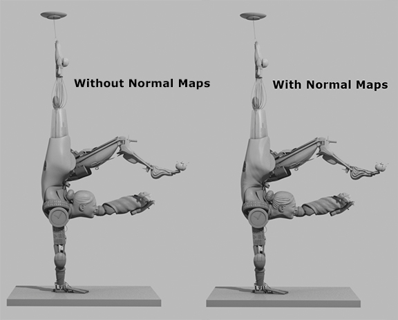
I realized then that the same problem might be occurring with my Addict, for I had the same kind of material set-up in the shader tree on that character, and, sure enough, it was! Once I rearranged the layers the character looked great from all angles! All of the places where the topology was fighting with the angle of the designs on him were hidden; he can still use some retopologizing to fully dispose of the problem once and for all, as well as allowing me to use a lower-polygon mesh, but, for now, he's just a higher-poly character who looks fantastic at least.
Aside from that exciting discovery, I did a lot more work on my gallery this week. I actually wasn't planning to do nearly as much work as I did on the gallery, but Tareq mentioned in my weekly critique that there were some scale issues in the scene. He said that the beams of the "fretwork" (that's the only thing that I can think to call the design in the ceiling, though it's much too large to be true fretwork) seemed to be too thick for the height of the rest of the room. He also mentioned that he was having a hard time reading the scale of the reading nook. Additionally, he pointed out that the strings suspending the pendant lamps weren't taut enough. So, first and foremost, I fixed the pendant lamp strings, because they were the most straightforward issue. Then I tackled the scale problems.
I consulted my roommate (who is an environment modeler) for help with this issue, and she suggested, first and foremost, that I bring a human figure into the scene for reference. I did this, and together we discovered that the scale of the reading nook was, indeed, off. I had thought that once I got the couches into that room that they would be a reference point that could pin down the scale of the space, but it turned out that just a reference point for scale wasn't really the issue. Once I got the couches in there and put the human figure next to it, it was revealed that the couches were too small, and there wasn't really enough room in the space to enlarge them. So, I had to make the room bigger.
Additionally, my roommate pointed out that the walkway between the wall and the columns, while wide enough for one person to navigate comfortably, wasn't really wide enough for two people to pass each other comfortably. This didn't concern me too much since it's supposed to be a private gallery in a large estate rather than a public space, but I kept it in the back of my mind when I re-scaled the room to enlarge the reading nook, and I did eventually factor a fix for that into the resultant room.

(Images with human scale figure are from AFTER the remodel.)
My roommate also pointed out that the reading nook was quite cut off from the rest of the gallery, and if one were to go into the gallery to read and enjoy the artwork, they wouldn't even be able to see the artwork from most of the seats on the couches. As such, I opened that space up to the rest of the room more in the redesign. I didn't open it up fully because I rather like the idea of a small, cozy space to relax with a book in, but you can easily see artwork from every seat in that room now.
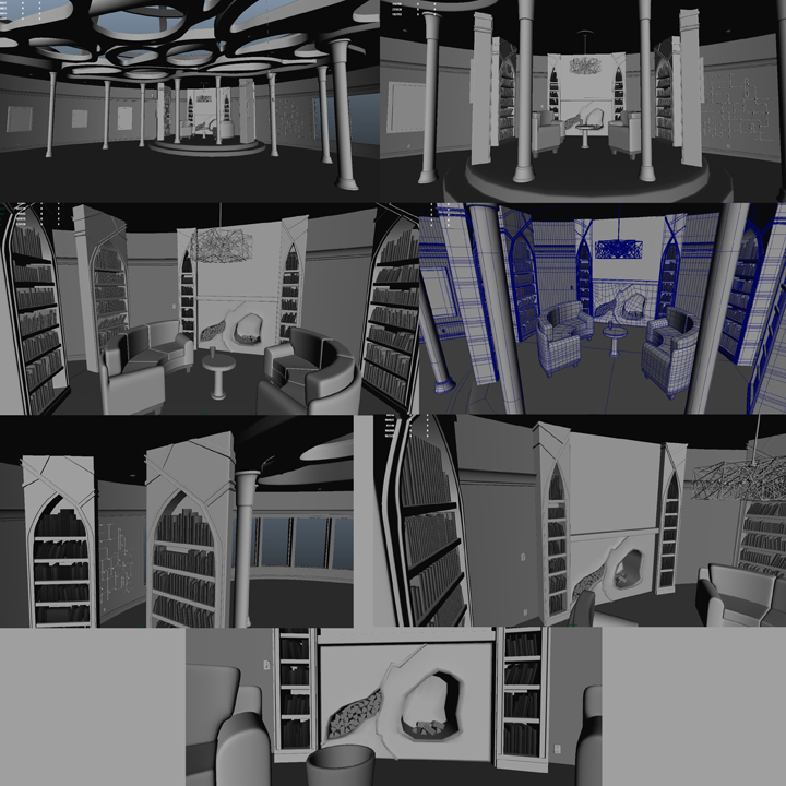
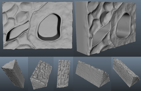
I was also presented with the opinion that the arches on the top of the bookcases didn't fit into the style of the room. I didn't quite agree with this statement until I modeled the fireplace and put it into the scene. The fireplace brought the organic elements from the larger portion of the room into the reading nook, and it looked a little out of place. Not wanting to have to redesign the fireplace, I thought that I could modify the design of the bookcase arches to make it fit more. I took the lines forming the arch and extended them beyond the arch, across the top portion of the bookcases in a flowy, branching pattern. It looked great. I loved it. But suddenly my chandelier was now the out-of-place object in the room. Everything else had either clean lines or was organic and flowy, and then there was my chandelier: a mass of sharp angles. Again, I liked my chandelier. I didn't want to lose it. So I thought again. I decided to retain the branching pattern on the bookcases, to keep them tied into the fireplace, but to remove the flowiness from the pattern. I chose to turn the design into straight lines and angles to match the chandelier, and I think that it works quite well. The lower portion of the room has more organic curves, and then the arches provide a nice transition as you raise your view up towards the top of the room where the angular patterns on the bookcases echo the angular chaos of the chandelier. I like it. I wanted the space to be kind of eclectic, but modern, and I really feel like it is. I fully intend to texture this scene after I finish up the rest of my thesis work, and I can't wait to see the results of that project, because I have a very firm idea in my head of what this space looks like with color and materials, and I want to be there in real life. I think it would be a fantastic room to spend time in.
But, anyhow, back from that tangent...
I tried to address the issue of the too-thick fretwork beams, and I reduced their size greatly, but I'm not quite sure if it was enough to satisfy the concerns of those who told me that it was too thick in the first place. I discovered when the first question about them was raised that those beams were nearly two feet thick in a room with a twelve foot high ceiling - no wonder they looked off! I wanted to get them down to the thickness of the crown molding, which is something like eight or nine inches (I can't recall for certain at the moment which it is, but it's definitely one or the other of those measurements), but I only managed to get them to just under a foot before they began to look too squished along the length of the round beams in the middle of each shell design. You see, those middle beams meet the flat walls of the rim of each shell design in a nice round arc, and the more that I compress the shape vertically, the less round that arc becomes. I was able to take off quite a bit of height by just bringing the lowest point the walls of each shell shape up to where the lowest point of that arc sits, but any thinning out after that only comes with compression of the arc, and, as I said, I was only willing to take that compression so far. I hope that it's not too heavy still. I guess I'll see when I get this week's feedback...

I also modeled some additional details for the room. I finished the couches that I referred to earlier in this post and sculpted them in ZBrush:

I'm still in the process of rendering the normal maps for them (which are being surprisingly difficult).
I also modeled and sculpted the aforementioned fireplace and stocked it with logs to light:
(The logs in the fireplace can be seen in the images of the reading nook above.)
I modeled a couple of light switches and a power outlet:

And I modeled some framed pictures and some additional light fixtures of the kind that I described in last week's post. Neither of these elements are anything extraordinary to look at, so I don't have any additional images of them, but they can be seen in the images of the full gallery space above (the lights are the little dots on the ceiling above the walkway between the columns and the walls in the gallery scenes - they're just small, shallow domes).
After finishing the gallery up I moved on to my Warrior. I don't have much to say about him because he's just a base mesh at this point.
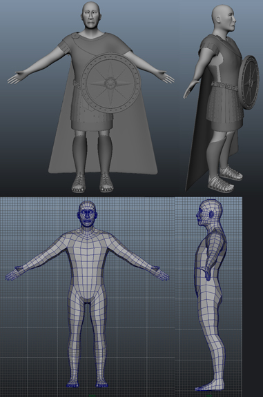
He needs a little bit of work still before he'll be ready to sculpt, but it shouldn't take me more than a day to get him to that point. He's got most of his additional pieces:
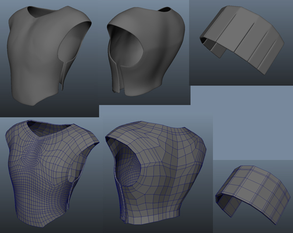
A breastplate:
A war skirt:

A cloak and a cloak pin:

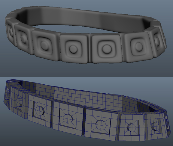
A belt:
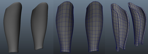
Greaves:
Roman Sandals (which were surprisingly fun to model and remain my favorite piece on him so far):

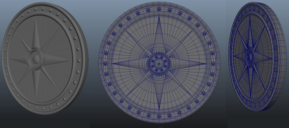
And a shield:
He still needs a helmet, a sword, a scabbard, eyeballs, and some tweaks to some of the existing pieces. Some of the pieces that I've built need straps added to them to secure the armor to his body (such as the breastplate, the greaves, and the shield), and a few others need minor tweaks to the topology, like additional edge loops. For example, the shield in the image above: I noticed after I took these images that it could use an additional edge loop split along the sections near the middle of the radius of the circle to square things off a bit more. I'm not happy with the overall shape of the warrior's face; at the moment it looks a bit monkey-ish to me, but I think that that is something that I'll fix once I get him into ZBrush. It's not a topology issue, it just requires adjusting the overall shape, which can be done easily in ZBrush with the move tool. I'm pretty happy with the overall proportions that the figure has started out with, and I should be, since I used the same method and image planes to build him as I used for the figure in my Organic Modeling 1 class. I like building standing human figures using that method because it makes me feel certain that I'm beginning, at least, with good proportions and clean topology. It takes some of the guesswork out of it. Then I can tweak things as needed to turn the characters into individuals from there. I haven't made too many adjustments to the shape of his mesh yet. I brought the arms up a bit and spread his feet apart before using him as a base on which to build the clothes, but that's about it. Tomorrow I should be able to finish his base meshes, and then I can adjust any proportions I that I need to and block in the lines on his overall shape on Monday, and then I can get down to the real work of detailing him for the rest of the week.
Depending on when my presentation date is (which I should find out in the coming week), I could end up with only about a week to finish this character before I have to move on to pulling everything together into finishing my presentation materials. That's only if I get the earliest possible presentation date, so there's a good chance that I'll have a bit more time than that to finish him, but I'm planning for the worst, hoping for the best at the moment. Either way, I'm not letting up this productive momentum that I've got going, so there's a good chance that, unless something unforeseen goes drastically wrong - (crosses fingers, throws salt over shoulder, and knocks on wood for luck) - images will be posted on this blog next week of this model either finished or nearly finished with the sculpting phase. I only get feedback on my characters weekly, so I'm going to find and consult a lot of reference this week to try to get things right the first time. I'm running out of time, but I caught a break with the Addict this week, and I'm hoping that I can avoid any more major, time-consuming issues from here on in. Wish me luck. I might need it!