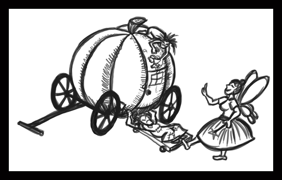
March 23rd:
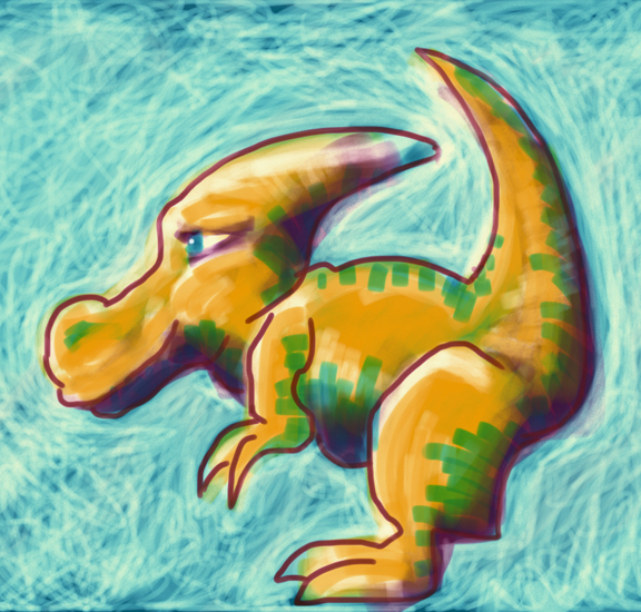
A quick iPad sketch today using my nifty Wacom stylus.
February 1st:
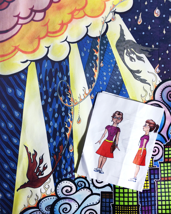
I refined the color of some of the areas of my Birds Over A City illustration and colored the character design of my next model.
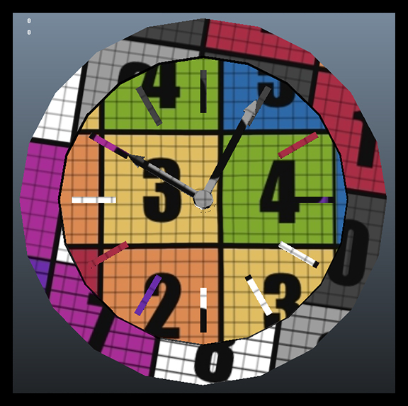
"Calendar" image of Daily Art created in January.
(Note: This image was actually created in February, but since I'm posting late I'm putting it here at the end of the month where it should go anyway.)
January 28th:
A few quick sketches to finish digitally later to approve the appearance of my resume.
January 12th:
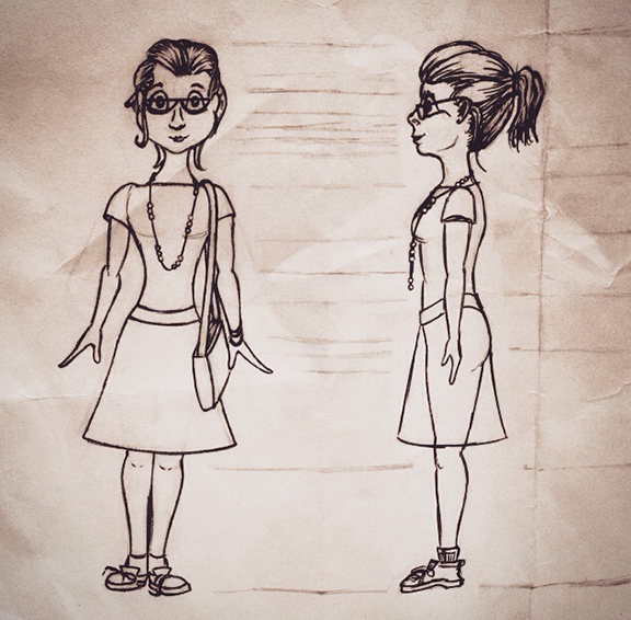
The design for the next 3D model that I would like to make: an artsy grad student that could easily fit into my 3D gallery scene. I envision her style a little like the female character in the Disney short "Paperman", but with a somewhat more relaxed, artsy vibe.
Day 104:
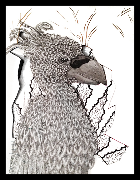
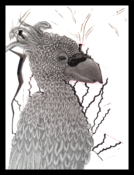
Ok, so it's not really a character sheet yet, but I began sketching to create one. Unfortunately the sketching was slow because I was doing a bit of a redesign during it, but I feel like I'm going in the right direction. The subject of my character sheet will be the Mother Nature character that I posted on this blog in earlier Daily Art entries. I decided to change the "cloak" to something detachable. It's now connected to a bunch of birds that land on Mother Nature when she wants to wear it and fly away when she doesn't.
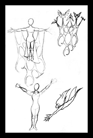
The bottom two images were sketched when I was considering that the character may be able to transform according to her environment, reflecting the flora and fauna of the location. I realize that there's not much to them, but they were just a couple of sketches while I was brainstorming...
Day 103:
I cut out some pieces of my cut-up sketchbook. They are difficult to see in this image without knowing where to look, but they're there:

It's been a busy week and a half since I last posted. I let a bit too much time get away from me between posts again, but it was for a very good reason: I put in an application to a Talent Development program at a major animation studio this week. Fingers crossed that something amazing comes of it! Now, back to daily art practices:
Day 75:
I revamped my demo reel a few times this week. Today I completed the most recent version; I fixed a couple of errors in the revamp that I completed earlier in the week. In the earlier version both my Gecko and my Juggler models disappeared shortly before the screen faded to black. One minute they were there, then suddenly they weren't, then the frame faded to black before progressing on to the next set of turntables. They both did this in slightly different ways for slightly different reasons, but I was able to identify both problems and adjust the file accordingly. I don't know how I missed it before I uploaded the version that I completed earlier this week to the internet...
Day 73 & 74:
I worked on the same thing two days in a row and never paused to take in-progress screen shots of it. So here is the finished image covering both days' worth of work.
I didn't complete this entire storyboard in the two days that I worked on it. I actually began the thing a few years back, then lost interest in it in favor of other projects. It's been nestled in the back of my mind on my to-do list, however, and for some reason I really felt that it would be a valuable example to add to my Talent Development program application portfolio. Most of the work that I completed over the two day span was coloring the panels. All of the initial drawing and layout was already completed, and I had blocks of color multiplied over each panel depicting the dominant shade that I wanted each frame to be. The work that I did over the weekend was pretty akin to coloring in a digital coloring book of my own creation.
Day 72:
Saturday's work was just a quick sketch of a lion head. I found myself studying the contours of the face of a leopard whose photograph appears occasionally as my computer's desktop wallpaper and wanted to draw a new version of it. Changing the proportions of the face turned it distinctly lion-like, but, as I wasn't really aiming for any type of cat in particular, I was pleased with it. I'd like to turn this sketch into vector artwork in Illustrator someday.
Day 71:
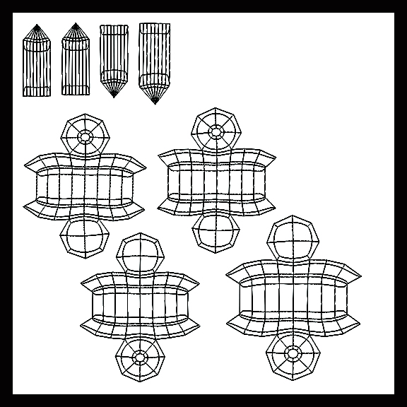
Friday I spent a short amount of time UVing the clock on my Juggler:

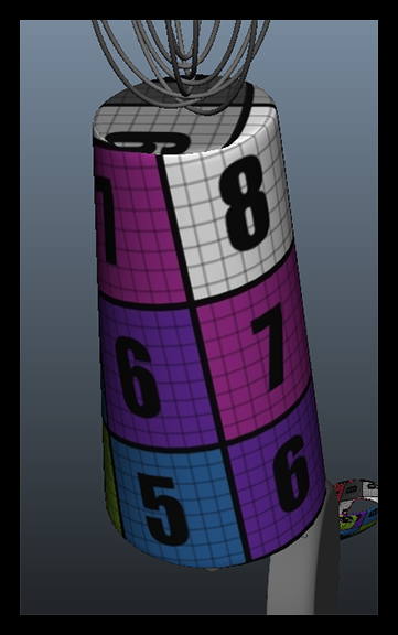
I've been UVing all of the Juggler's pieces separately because I started working on the character this way, but I know now that that was a mistake. Having a separate UV map for each piece of the character wastes space and makes the character far too data-heavy to function efficiently. I can't do much to fix all of the UVs on the objects that I've already added normal and texture maps to without re-doing an awful lot of work, but I can, and will, combine the UV maps of some of objects that have no texture information to them yet before I go about adding such information. I'm planning to dispense with the procedural textures that I gave the Juggler for my thesis and texture paint her in Mudbox instead. She will be a wonderful piece to add to my texture portfolio, which is distinctly lacking at the moment.
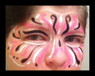
Day 70:
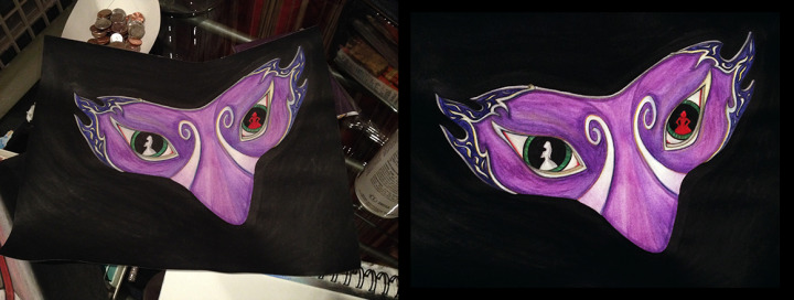
My art on Thursday consisted solely of a quick little face-painted mask of-sorts. More practice for when I begin doing this at the farmer's market.
Day 69:
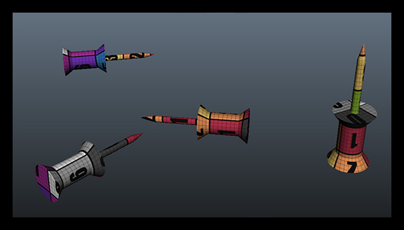
Wednesday was the day that I truly revamped my demo reel. I fixed the little issues that I missed later in the week, but this was the day that I truly put effort into working on it. It's fairly similar to the reel that I've been using (it features many of the same models with the same turntables), but the turntables are re-ordered to showcase my best models first. I know that this is how a demo reel should go: you show your best work first so that the recruiter who views 100 demo reels per day becomes interested immediately and doesn't just turn your reel off thinking that everything on it must be as mediocre as the first thing and move on to the next reel. I know that's how it works, and yet... I've been using my thesis reel because I know that it has my best models on it. The problem is: I designed my thesis reel to work up to my best work because I knew that the panel that it was intended for was going to watch the entire thing and then discuss it. I saved the best for last, which is exactly opposite of what you should do when you create a demo reel. And somehow, until quite recently, I missed the error. I never revamped my thesis reel to make it more appropriate as a demo reel in any way other than changing the slate information to be more suited to its purpose; until now.
The new reel puts my Addict first, followed by my newly-textured Gecko. Then comes the Juggler and the Warrior. Next is the Gallery environment. I nixed the still image of all of the models in the environment together because it no longer reflects the current state of the models now that the Gecko is textured; it also makes the addition of my Felix model tagged onto the end distinctly out-of place.
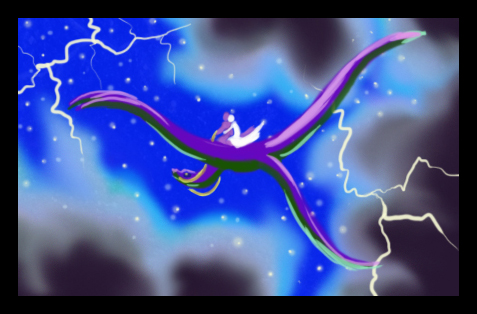
This version of the reel includes the 8-bit Dragon for "Amazing Adventure" at the very end after Felix, but I nixed that turntable later in the week when I fixed the errors in the reel because I'm just not happy with the quality of the turntable that I created for that model. It's not lit properly, the speed isn't constant, there's no wireframe view... It just looks unprofessional compared to the rest of the reel. Felix doesn't have a wireframe turn either, but the quality of the turn-around that he does have is so far above the one that I quickly set up and rendered of the dragon that I'm still satisfied having him at the end.
Day 68:
I spent the first three days of this round of daily art prepping my Szeth-Son-Son-Vallano model for 3D printing.

I'm not planning to sell him or anything of that nature, but, after the artist who designed the character said such nice things about the model, I figured that it would be nice to have a physical representation of him. I might even try to send one to the artist and the author who created the character if I'm successful; I know that the author, at least, really appreciates fan art.
Unfortunately, getting a model such as this ready for 3D printing is no easy feat. First off, The model has to be water-tight, which means one single, solid piece. When I built the model he consisted of exactly 15 different pieces. It also has to be under one million polygons, and the model that I built had something like 8 million quads if my memory serves me correctly. There is also a minimum thickness that any part of the model can be (how much that is depends on the material used to create the print), a minimum distance between two separate sections of the model (which means no intersecting or otherwise touching geometry), and a slew of other stipulations about the dimensions of the piece which will cause me less grief than the few that I have already mentioned. This means that I had to decimate the model to bring the poly-count down below one million while keeping all of my sculpted detail, and then connect all of the different pieces and any piece of geometry currently touching any other (this includes connecting the fingers resting on the surface of the model's face to the face as well as attaching the wrists to the sleeves and the coat to the shirt and the pants to the belt and every other piece to all of the other pieces).
I originally thought that I could complete the task of connecting all of the different pieces of the model fairly easily by putting all of the subtools on one layer in ZBrush and Dynameshing the entire thing, but it didn't work as well as I'd hoped. The geometry that Dynamesh produced needed so much clean up that it just wasn't worth it - at least by pixel-pushing and merging vertices in Maya I have more control and can keep track of what's going on with the shape of the model. I couldn't even make sense of all of the intersecting geometry that Dynamesh created...
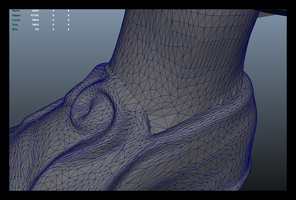
So, after trying and failing attempted shortcuts in ZBrush a few times I brought the decimated model into Maya and have been merging vertices "by hand" ever since. The model will still require a lot more work before it's done, as well as some additional ZBrush sculpting to clean up the flow of the seams once the model is all one piece, but it's coming along:

The above image illustrates where I've deleted geometry from both the shirt and the belt in the areas that it overlaps. Next I will connect the vertices to make it water-tight.

This image clearly illustrates why the model will require extra sculpting in ZBrush to clean up the newly-created seams between the previously separate items.
Day 67:
On this day I connected Szeth's calves to the inside of his trouser legs:

This image shows all of the successful connections that I have made thus far:

Day 66:
The first day that I worked on Szeth I began by connecting his shoes to his feet.
That's all that I did last week. The coming week should be very heavily Juggler-oriented, as I'm trying to create all-new textures for her in the hopes of submitting her for consideration in the Academy of Art's Spring Show. I think she'd be a fine fit for the Hard-Surface Model category.
This past week I've neglected my art a bit: I only did quick little projects here and there. I didn't spend any great amount of time on any one thing. Early in the week I tested out some new face paints that I got so that I can begin earning some extra money face painting at a local farmer's market. In the middle of the week I switched gears to a drawing/painting that I created as a birthday gift for my father, and this weekend I've UVed a couple of objects on my Juggler, because I want to go back and hand-paint all of her textures rather than using procedurals.
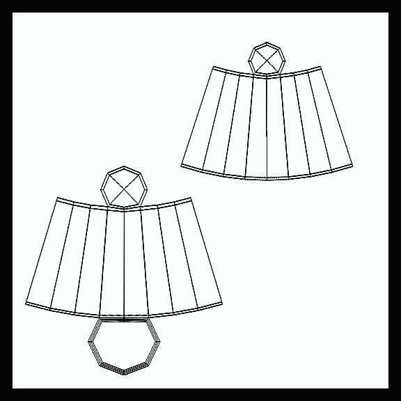
Day 65:
A quick UV job:
Day 64:
Push pin UVs:
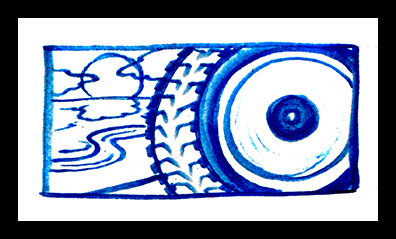
Day 63:
I painted (well, sort of: I cheated by using a paint pen rather than a brush) text on a painting/drawing that I'd completed the day before.
I'm not entirely happy with the text. It's a little squished at the bottom and a bit too large up top, but there wasn't much to do about it unless I'd re-painted that whole section, and I lacked both time and motivation for that...
Day 62:
The painting minus text:
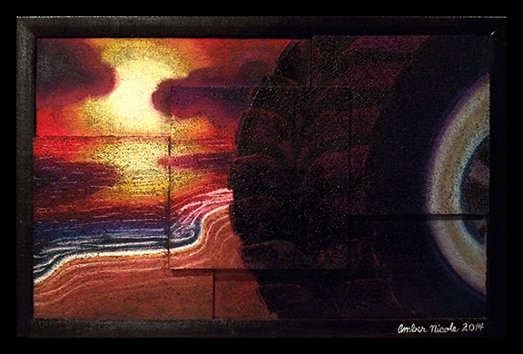
I keep calling this a "painting" or "painting/drawing" because it's actually mixed media. The only colors that I painted were black and white (and the white was only for the signature). Everything else was pastel. The pastel was originally much more vivid, but it developed dark spots following the "grain" of the cork that I painted the image on when I sprayed it with a clear gloss coating. I'm not entirely sure why that was, but I also wasn't too upset by it because the new texture reminded me quite a bit of the rough rubber texture of a tire. So I went with it.
Day 61:
On this day I put together the cork pieces used in the image, painted everything with a black base coat, and drew up a couple of quick concepts for what I wanted the image to be. This one won out:
Day 60:
On day 60 I had my first successful test with the face paint that I was practicing working with:
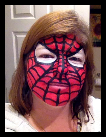
The ones that I did before this, however, were not nearly as successful...
Day 59:
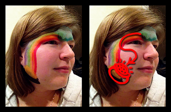
The above image is what I painted and a guide for what I decided afterward that I should have painted. The painted image was too far back on the face: the rainbow should have made a tighter curve around the eye so that the pot of gold would land more on the surface of the cheek rather than falling off the face down toward the neck. Now I know for next time.
Day 58:
My first test with the face paints wasn't on a face, but rather my own hand.
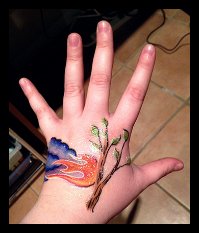
This image has all kinds of glitter and shimmer powders and such on it because I wanted to test all of the different types of products that I'd gotten and then make sure that it would all come off with the make-up remover cloths that I got to use with the paints. I just kind of doodled whatever came out of my head here, and I'll be the first to say that it wasn't very impressive, but, hey, it was just a test... I'll get better at improvising with this stuff.
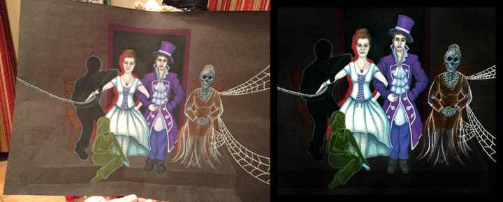
I've spent the last week working on the film artwork that I mentioned in my last post, and I've gotten permission from the director of the project to share the pieces that I've created for the film here. The drawings that I created are basically set dressing pieces that are supposed to have been drawn by the main character in the film. So, without further ado, here are the pieces that I created for my first outside freelance art contract:
Days 51-57:
The First Concept:
The Drawing:
(Actually, the "concept" for the first one is really just the same drawing minus a few revisions. I just started sketching with pastels after I got the job and came up with that image, then decided that rather than creating everything on-the-fly at full size I should do a few thumbnails to give the director choices for the final pieces. Hence, from here out, the concepts will actually be completely separate images from the finished pieces.)
The drawing is pastel on black paper; approximately 11 x 17".
The Second Concept:
The Drawing:
The drawing is pastel on black paper; approximately 10 x 13".
The Third Concept:
The Drawing:
The drawing is watercolor pencil and marker on white paper; approximately 11 x 14".
The Fourth Concept:
The Drawing:
The drawing is marker and watercolor pencil on white paper; approximately 11 x 14".
The Fifth Concept:
The Drawing:
The drawing is watercolor pencil, marker, and charcoal on white paper; approximately 11 x 14".
The Sixth Concept:
The Drawing:
The drawing is colored pencil on black paper; approximately 12 x 16".
The Seventh Concept:
The Drawing:
The drawing is watercolor pencil, charcoal pencil, and colored pencil on paper; approximately 11 x 14".
The Eighth Concept:
The Drawing:
The drawing is watercolor pencil, pastel, colored pencil, and a tiny bit of liquid paper on white paper; approximately 11 x 14".
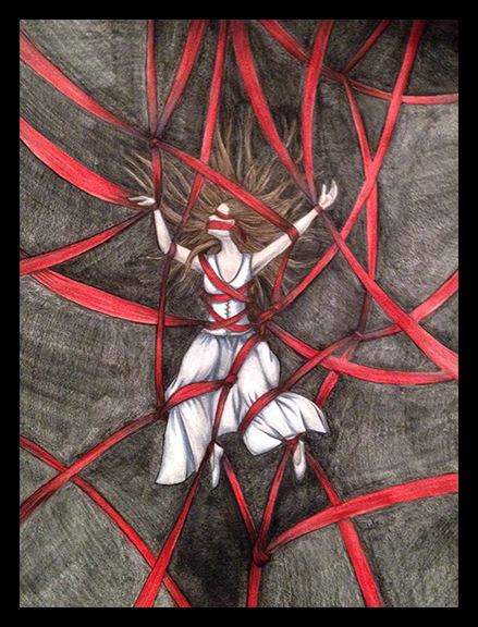
I finished the last of the drawings yesterday and spent my artistic hours today fixing the extremely quick cell phone pictures that I took to document the drawings into something more professional looking.
Here are a couple of examples of today's work:
and
I am satisfied.
Day 50:
Today is my 50th day of Daily Art.
I should have something really special to share to celebrate that, right? Well how about this: Rejected concept art from my first paid job doing artwork for a film.
That's right. I got my first freelance gig from someone outside of my own circle of friends and family!
The work isn't either high profile or high paying, but I don't care: I feel like I'm on the way now. As much as I truly appreciate compliments on my artwork from my friends and family and anyone in my own circle of acquaintances, it's been difficult to keep my dream of a creative career intact when no one outside seems desirous to pay for my work. Then I got a call from a friend of a friend whom I'd never spoken to before this, and now I'm being paid to do artwork for set pieces in a film.
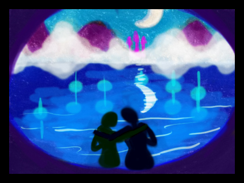
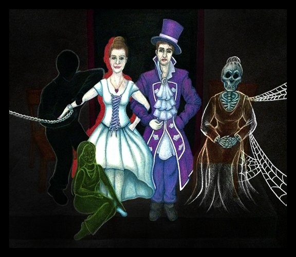
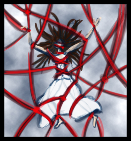
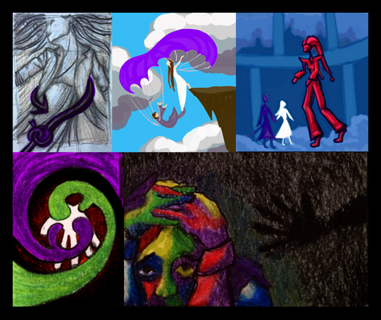
I spent the last two days after I finished editing my Gecko video drawing concept sketches for the artwork that the director wanted, and today she made her final selections. I will not be posting the concept sketches that were chosen or any of the closely related variations on the ones that were chosen because of their direct link to what will be in the finished film, but the sketches here were just free-flowing ideas that I conceived to depict either trauma or fantasy. They have no direct links to the plot. There are, of course, elements in them that tie into the film project, but it won't give anything about the film away to share them. The main ties are things like color scheme or the emotions being conveyed, and you can't put a copy-right on that. In fact, I like the top three images so well just as fantasy scenes that I'm considering doing full versions of them with just a few minor tweaks as portfolio pieces in the future. (Then again, maybe more than just minor tweaks on the far right one: I want to play with the composition of that one a bit more...) I'm especially fond of the top left one - I already have the paper and media picked out for it and everything.
So, here they are: rejected concepts from my first professional freelance art job:
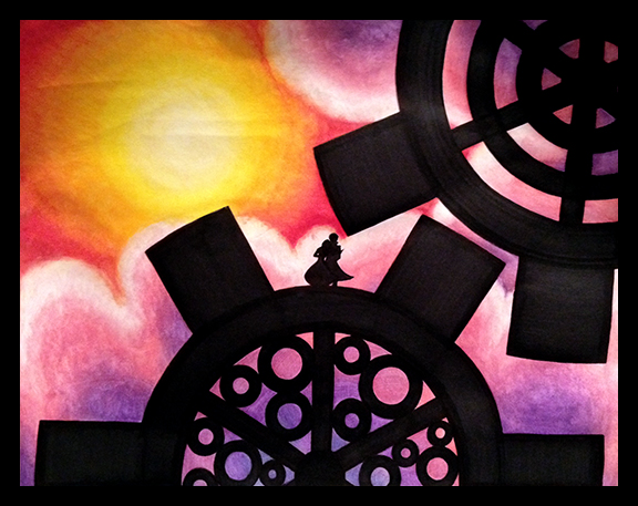
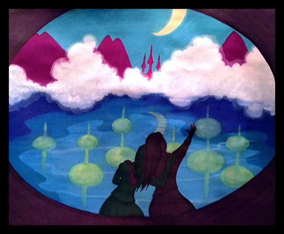
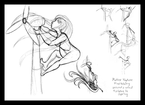
I have begun the digital painted version of Mother Nature.
Day 45:
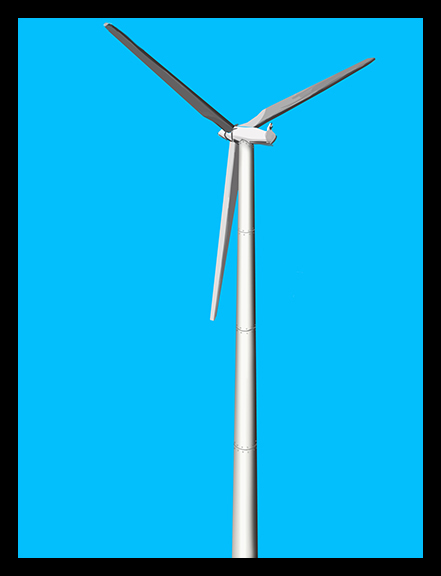
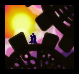
The first stage of the wind turbine on which Mother Nature is frolicking.
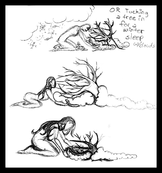
Day 44:
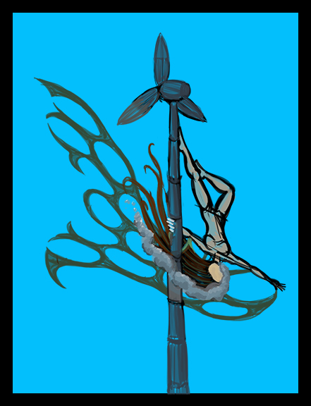
The sketch depicting the general layout of the digital image.
A Little More Artwork That I Did Today:
I started painting textures for my Gecko model in Mudbox.
Then I cleaned up the textures a bit in Photoshop:
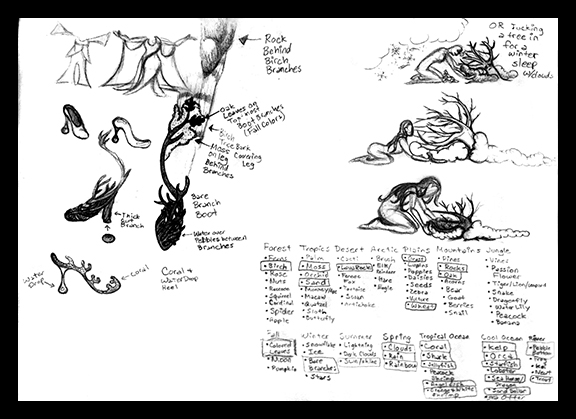
Days 37 - 43:
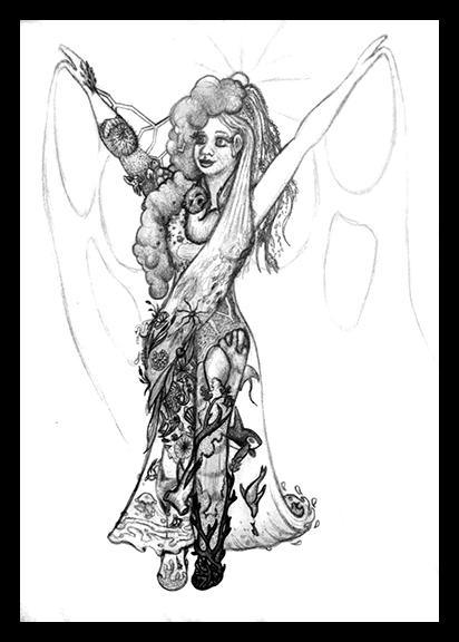
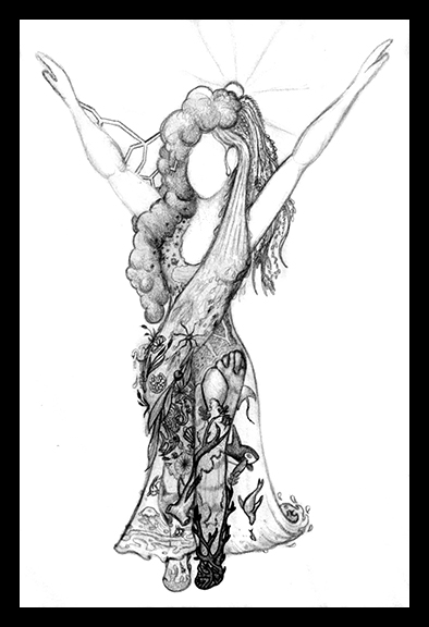
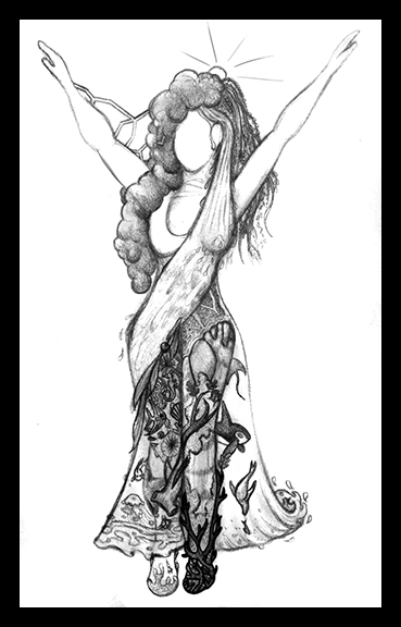
I've had a lot going on in the past week, but I managed to make a tiny bit of progress each day on my Mother Nature design. Unfortunately I failed to document her each day as I've done in this past, but whatever is in the folowing image that wasn't present on last week's post is the cumulative total of this week's progress:
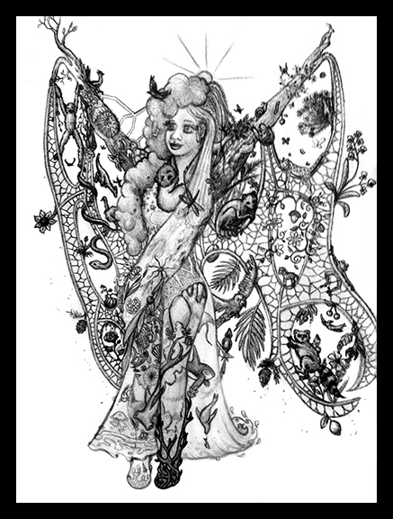
This image of her is now complete. Next up is a full-color view of her in a posed position.
I've made more progress on the Mother Nature design over the last few days:
Day 36:
Day 35:
Day 34:
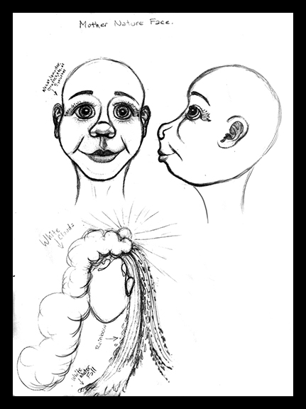
Day 33:
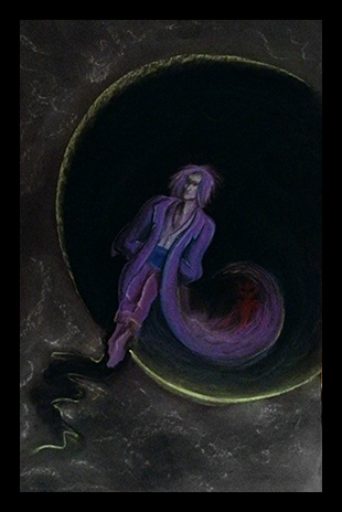
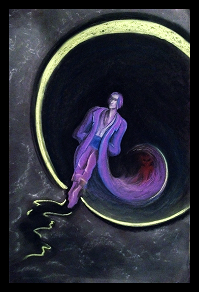
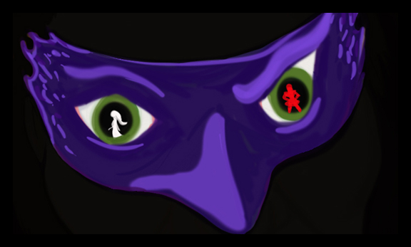
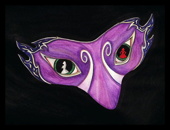
Just some quick concept sketching today:
I'm planning a piece of digital artwork depicting a character design for a sculpture and 3D model of a Mother Nature figure. I'm trying to improve upon the design and execution of a sculpture that I completed many years ago. The basic concept for the character's design will be the same, but I hope that the character will benefit from my additional years of study by attaining a new sophistication and depth this time around. I've had many new ideas for her costume elements over the years, and I plan to improve upon the generic pose of the original by giving her a sliver of environment to interact with so that she will portray a bit of a narrative as well as an interesting design in her new incarnation.
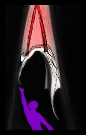
I also did another random little concept sketch:
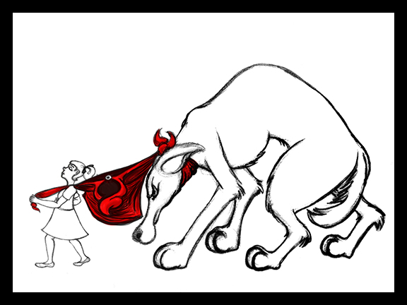
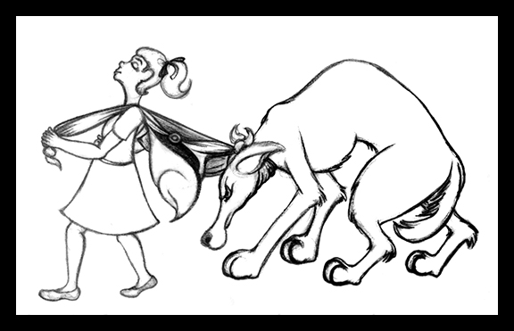
I have no immediate plans to transform this concept into a full artwork. It was just something that popped into my head after my sister saw the Red Riding Hood sketch and suggested that I create a whole series of Fairy Tale twists. This image doesn't really speak to me the way that Red Riding Hood did. I like it, but it just doesn't seem quite as poetic as a tiny Red leading the huge wolf along by a leash made of her cloak...
Catching Up: Part 2.
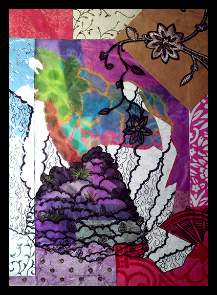
Day 32:
Today I have spent a lot of time fixing photos.
I've been cropping, tweaking perspective, adjusting color balances, levels, and saturation, painting out random tiny artifacts, and much, much more. And after all of that, I did this:
This is an early stage of a painting. It was originally intended to be an acrylic painting, but after adding a quick layer of color to the cloak I'm considering switching it to a digital painting... We'll see how it goes I guess.
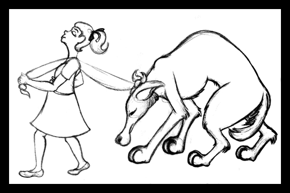
Day 31:
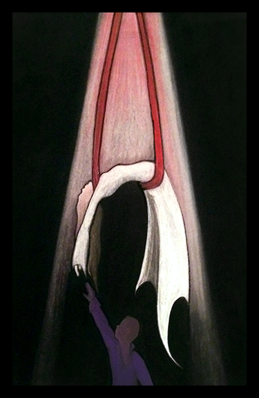
Yesterday I drew the sketch that was the beginning of the Red Riding Hood image:
By the end of the evening it looked like this:
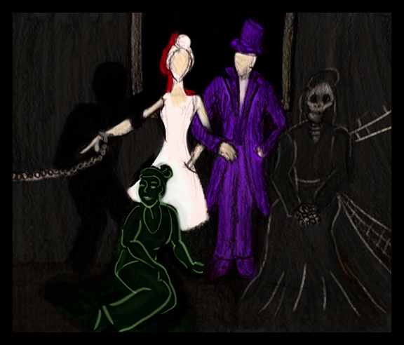
Day 30:
I drew some thumbnail storyboard sketches.
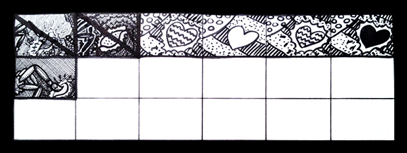
The heart image series is separate from the other images. I wasn't really going for full-on storyboarding here: I just wanted to get a few images that I hope to properly storyboard later out of my head for now before I bury them with other ideas and forget what they looked like. There are still more images related to this story that I need to get down, but this is all that I've gotten to for now. The first two images are crossed out because I simply wasn't pleased with how they turned out.
Day 29:
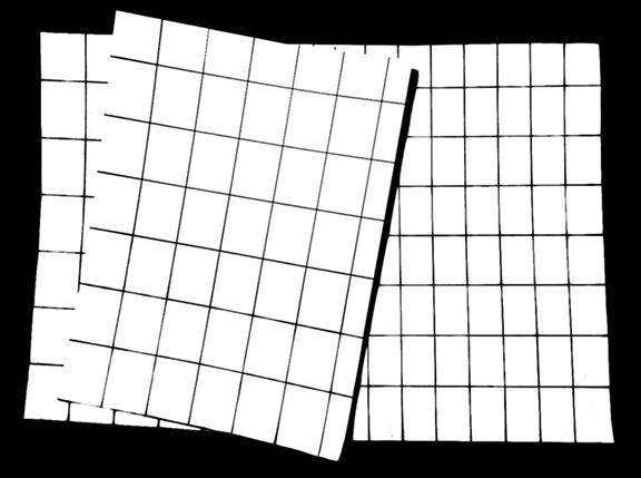
This day I just spent time drawing grids on paper to have a place to work on my storyboard thumbnail sketches.
Day 28:
Some work in my Cut-Up Sketchbook:
Day 27:
More Cut-Up Sketchbook:
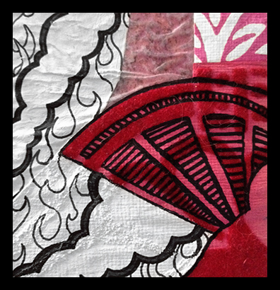
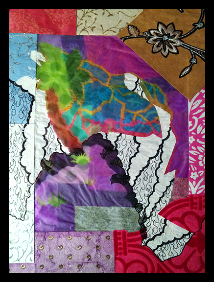
Day 26:
Even more Cut-Up Sketchbook:
Day 25:
The day that began this particular series of Cut-Up Sketchbook doodling:
Day 24:
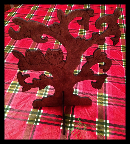
Switching gears now to painting:
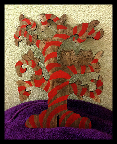
It's not much to look at - just the early stages of a painted project. I bought the wooden tree with the black outlines on it, but I'm going to paint it my own way. It'll still be owls and hearts in a tree, but it should end up fairly different from the original design.
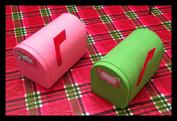
Day 23:
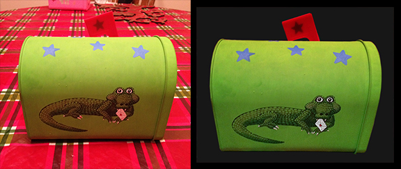
This was quite a long day of art as I painted mailboxes for my niece and nephew for Valentine's Day.
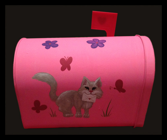
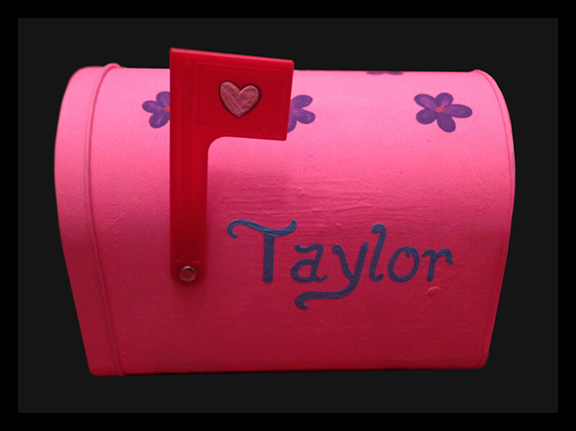
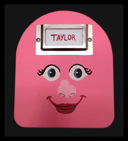
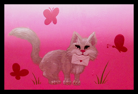
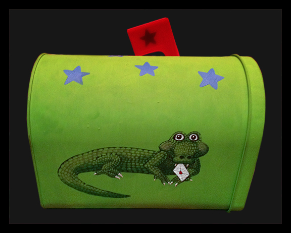
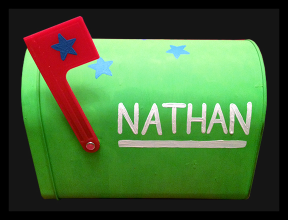
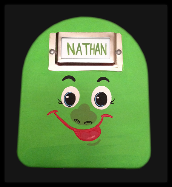
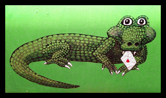
They're quite simple, but I figured that I didn't need to make them masterpieces since they're playthings for a three and five year old...
Day 22:
This day was the the day that I painted the base coats of color on the above mailboxes.